What's new

Different Point of View

LittleMan

TPF Noob!
Joined
Dec 14, 2004
Messages
6,648
Reaction score
143
Location
Texas
Can others edit my Photos
Photos OK to edit
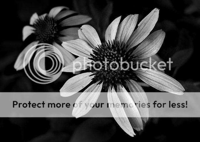
What do you think about the texture of this photo?
I was trying to surpass the color that everyone expects in a flower and go more towards the shape, feel and texture of the plant.

Taken with my DMC-FZ20
EXP time: 1/125
F-stop: 2.8
ISO: 80
I underexposed it one full stop.

184241.jpg


I know there are a lot of B&W flower pictures but I was hoping this would be different in a way to show the true texture of everything.

Thanks for looking!
-Chris
 
I like the composition and the depth in the photo. It is a tad dark, I think the smaller details would add if it was brighter a bit.
 
Thanks Geronimo,
I will try that later. :)

any other comments/suggestions.

good or bad. :)
 
I like the picture. The texture and feel are there and the black and white works nicely. The one stop down also worked great in my opinion, all the important details are still there and the leaves don't get blown out. The only little thing I'm not sure about is how the edges of the pedals go out of focus with the shallow depth of field, but that isn't a big deal.
 
The only little thing I'm not sure about is how the edges of the pedals go out of focus with the shallow depth of field, but that isn't a big deal.
Agreed. And it's a little flat, overall. Try to see how much contrast you can add without losing detail. You'll get there. :)
 
OK, I took all of your recomendations and this is what I came up with:

Original:
184241.jpg


Edited Version:
184241cont.jpg


I know that with the change everything pops out more and it's not so flat... but I think that maybe it kills it's "old look" That I like to see in some pictures.

What do you think?
 
I think it adds to that feeling myself. The details in the flower pedals look fragile, or more so, to me.
 
I like the more contrasty shot, It seems more edgier, gives it a lot more texture in the petals (if that makes sense). Makes me think newspaper for some strange reason :er: :lol:
 
I prefer the softer one. the uped contrast photo looks to surreal. It pulls me in to look at put then I get this feeling like your trying to make me look at by saying here is the texture. The first is soft a conveys the sense of what a flower is... naturally beautiful. You can look at it and not feel like your forcing the texture at the viewer. You could also switch this way of thinking to the oppostite if thats what you want the viewer to think or focus on. Just my .02
 
Vmann said:
I prefer the softer one. the uped contrast photo looks to surreal. It pulls me in to look at put then I get this feeling like your trying to make me look at by saying here is the texture. The first is soft a conveys the sense of what a flower is... naturally beautiful. You can look at it and not feel like your forcing the texture at the viewer. You could also switch this way of thinking to the oppostite if thats what you want the viewer to think or focus on. Just my .02
actually I agree with you... although the second one has more contrast I still don't think it's better.
I like the feel of the first(softer) one.
 

Most reactions

Back
Top Bottom