What's new

Diptych of a local model (Critiques Please)

nicholasmoegly

TPF Noob!
Joined
Aug 16, 2012
Messages
7
Reaction score
0
Location
Cincinnati, OH
Can others edit my Photos
Photos NOT OK to edit
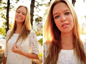
A local model contacted me to do some shots for her portfolio because she changed her hair color. Any constructive feedback is welcome!

$7808249432_a2dcb17314_c.webp
 
Last edited:
Her features look very distorted in the close-up shot...chin looks big, nose looks big, and her two front teeth look almost cartoonishly large. While a nice big head is okay, achieving that large head size by getting way too close is not a good "look".
 
I agree with Derrel and have two questions: 1. While I like the look and effect of the sun as a hair/rim light, why would you not increase your fill so that you didn't have such a blown sky? As-is, and remembering that the eye is naturally attracted to the brightest areas, between the white of the clothing and blown sky, I want to look everywhere but at her face, and 2. If the goal was to show off her new hair colour, why, in the RH image have you cropped so much of it away?

I would suggest a re-shoot with a better background and longer glass. These aren't bad, but they could be a lot better.

Just my $00.02 worth - your mileage may vary.

~John
 
Hmm ok, well thanks for the feedback. I personally really like the blown out look of the sky, that's done in a ton of photos by a lot of good photographers so I don't think that's really a faux pas. To your second question, her hair is showcased really well in this diptych, and a close up like in the right photo brings that much more attention to it.

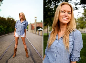
I was personally really happy with how this edit came out but I guess there are just different tastes for different styles. What about this other shot:

$diptych3.webp
 
It's your work, and if you're happy, and the client is happy, that's what counts. Of the two additional photos, the LH image seems slightly soft, but the RH one is very nicely done.

I understand that the blown background is a popular trend today, BUT the reason that I mentioned it here was nothing to do with fashion or trends, but rather because of human behaviour. As I mentioned in my first post, the human eye is naturally drawn to the brightest areas of a photograph. If you are trying to showcase the hair, then I would suggest that you don't want want it in the middle of a distracting area (the blown sky) since that will cause it to be in competition with the sky for the viewer's attention.

I would also suggest a differnt colour top; the blue top she's wearing in the second set is ideal; notice how much more visual presence her hair has? None of it's being "lost".

 

Create an account or login to comment

You must be a member in order to leave a comment

Create account

Create an account on our community. It's easy!

Log in

Already have an account? Log in here.

New Topics

Back
Top Bottom