Sweetneers
TPF Noob!
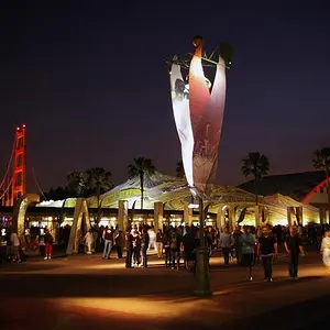
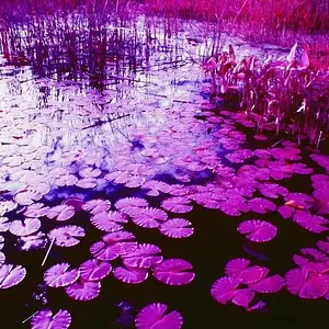
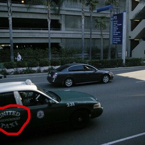
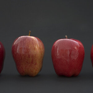
Does this look silly? It's for an Ad campaign I was hired to do. I wanted to do something different, but I can't tell if this looks stupid or not. I know the masking could use a little work. This isn't the final version. I just want to know if the concept is coming across.






![[No title]](/data/xfmg/thumbnail/37/37115-e2d49d984453c62a2a20cf741e3d6679.jpg?1734169831)




![[No title]](/data/xfmg/thumbnail/37/37113-886cb28b1e3fb197bdd00a9148269407.jpg?1734169831)