What's new

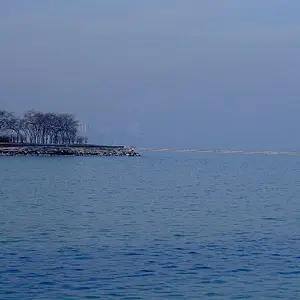
Door County, WI

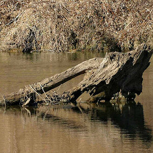
like the first one too. seems like it needs more contrast or color though its kind of flat. Interesting sky it takes up a lot of the frame though. have you considered what a crop would look like? just a thought.
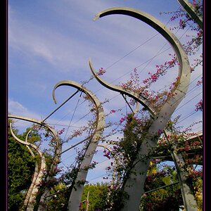
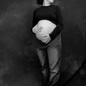
the second one has a spot issue.

it's "spotting"
 
I caught the spots after the export. Hate when that happens. They're birds, I think. Big ones, too, so it's kinda cool that they're that tiny, but GET OUT OF MY PICTURE. :lol:

I was actually afraid to oversaturate the first. I've had a habit of cranking the saturation in the past to the point of NOPE, so I was being a bit more subdued with it. I'll play with it a little more tomorrow, I think, try what you mentioned. I like big skies like this, but trying someone else's perspective never hurts and could be educational.
 
I caught the spots after the export. Hate when that happens. They're birds, I think. Big ones, too, so it's kinda cool that they're that tiny, but GET OUT OF MY PICTURE. :lol:

I was actually afraid to oversaturate the first. I've had a habit of cranking the saturation in the past to the point of NOPE, so I was being a bit more subdued with it. I'll play with it a little more tomorrow, I think, try what you mentioned. I like big skies like this, but trying someone else's perspective never hurts and could be educational.
jmo. im sure more qualified than me will comment on it. The first one isn't even really that off in that way I shoot sooc similar all the time. Its just that we have all been so exposed to high sat and contrast images for so long making them "pop" we forgot what a normal damn photo looks like. so I wouldn't say it is off, just most people add color sat especially to landscape to make them appear more rich.
 
free bump
 

Create an account or login to comment

You must be a member in order to leave a comment

Create account

Create an account on our community. It's easy!

Log in

Already have an account? Log in here.

Back
Top Bottom