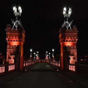
kundalini
Been spending a lot of time on here!
- Joined
- Jul 18, 2007
- Messages
- 13,607
- Reaction score
- 1,937
- Location
- State of Confusion
- Can others edit my Photos
- Photos NOT OK to edit
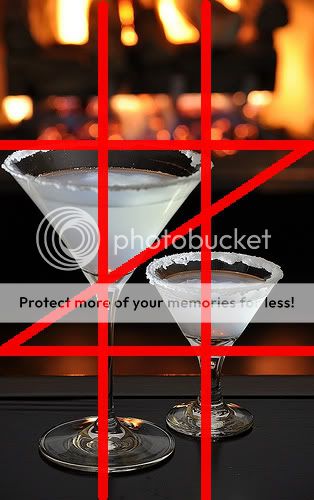
I will comment on photo #1.
The title works well with the photo. Nice choice of presentation, whatever you're drinking. The contrast of the cold drink wrapped in the warm light of the fireplace tells me this is going to be an evening for consensual adults.
I think the crop is much too tight on the left and does not welcome my hand to grasp it. The difference in size of the glasses gives off a slight dominant / submissive tone to it for me. However, the little reflections in the bottom of the glass and in the stems are brilliant. Again going in total contrast.
I would have liked to have seen a bit more definition of the flames in the fireplace. Perhaps a smaller aperture to reduce the background blur.
As for hitting 3 out of the 4 intersect points...... congrats.
Ignore the slash, I was too lazy to remove.

![[No title]](/data/xfmg/thumbnail/41/41795-6bc3a19e590a6be6bd169ab2acaee30d.jpg?1619739896)
![[No title]](/data/xfmg/thumbnail/37/37280-a7e70a01ccd331918e71645cd4c1f16e.jpg?1619737977)
![[No title]](/data/xfmg/thumbnail/42/42329-331b54ea6493a8cdd21d8e624fe97e85.jpg?1619740129)
![[No title]](/data/xfmg/thumbnail/41/41799-fe172a668fba7717bf773664387d64aa.jpg?1619739897)