What's new

Ehh... It's a Picture of a Rose.

mrpink

No longer a newbie, moving up!
Joined
Jan 8, 2010
Messages
1,962
Reaction score
328
Location
Cincinnati, Ohio
Can others edit my Photos
Photos OK to edit
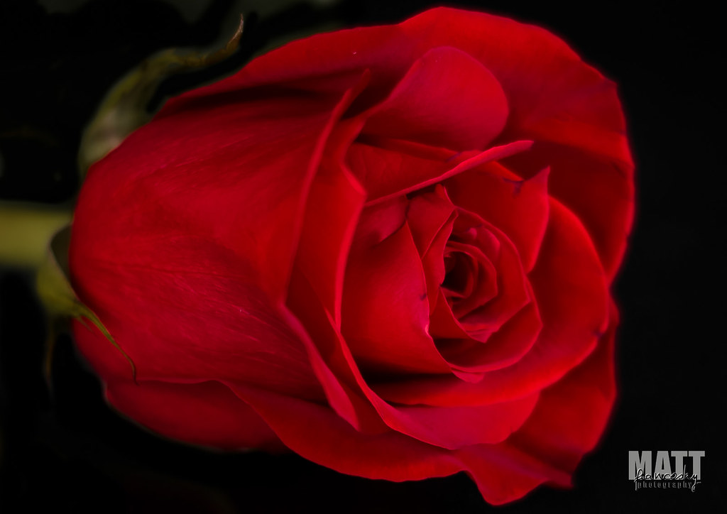
5 year wedding anniversary yesterday. Got my wife some roses. Bored today, took some photos of them. Played around a lot in Lightroom, think this one is the most interesting of the bunch. Shot with my 50mm @ 1.8, going for a very shallow DOF.
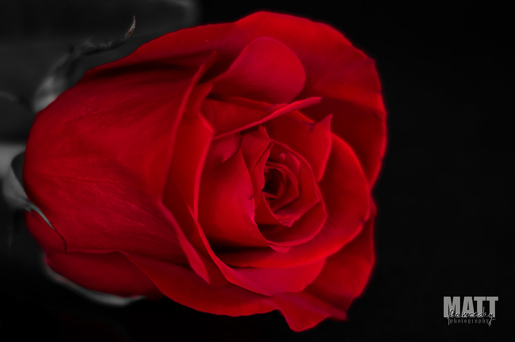

DSC_8029ww by Matt Francosky, on Flickr

Let me know what you think....


p!nK
 
nice shot, good colors.
 
Great image and the color is vibrant and images sharp.
 
I think its horrible....lol jk this works. very nice
 
good shots and congrats on making it to 5 years. youve outlasted most of hollywood at this point.
 
Excellent capture, I do have a suggestion however - take a spray bottle and gently spray some water on it so that it forms a few drops on the petals.

I have to admit, the out of focus petals nearest me are a little distracting.
 
Excellent capture, I do have a suggestion however - take a spray bottle and gently spray some water on it so that it forms a few drops on the petals.

I have to admit, the out of focus petals nearest me are a little distracting.


Yeah, I thought about the "fake dew" look, but with the super shallow DOF I was going for I feel it would have looked odd.


p!nK

 
I like it, but am surprised none of the "critics" around here haven't ripped on the selective color.
 
I like it, but am surprised none of the "critics" around here haven't ripped on the selective color.

Because after so many people say it's wonderful, it's hard to come in and be the ass that says it would probably work better cropping the dead space on the right, which would allow the eye of the rose to fall closer to a, get this, thirds intersection rather being centered and the image weighted to the left. I'd like it more if there was at least a little desaturated green for a bit of contrast, and leaving the rest b&w, if you must.
 
I like how it is looking into the frame but it needs a bit more on the left & a little less dead space on the right. I know you were after a short DoF but I would like to see more.
 
I like it, but am surprised none of the "critics" around here haven't ripped on the selective color.

Because after so many people say it's wonderful, it's hard to come in and be the ass that says it would probably work better cropping the dead space on the right, which would allow the eye of the rose to fall closer to a, get this, thirds intersection rather being centered and the image weighted to the left. I'd like it more if there was at least a little desaturated green for a bit of contrast, and leaving the rest b&w, if you must.

My favorite teachers in school never gave me straight A's.

Here is a quick re-edit.


DSC_8029-3ww by Matt Francosky, on Flickr

I do like the desaturated green. It adds just enough color but doesn't take anything away from the overall mood I was going for in my original edit. The crop, I am not to sure on. I like having some dead space in the frame, so it isn't just a red rose shoved into your face. I might play around with that some today.


p!nK
 

Create an account or login to comment

You must be a member in order to leave a comment

Create account

Create an account on our community. It's easy!

Log in

Already have an account? Log in here.

New Topics

Back
Top Bottom