What's new

Engagement For c&c

cdnaiphoto

TPF Noob!
Joined
Jul 8, 2010
Messages
56
Reaction score
0
Location
New Mexico
Can others edit my Photos
Photos NOT OK to edit
_DSC04704.jpg


_DSC0297.jpg


_DSC0180.jpg


_DSC0041.jpg


_DSC0040.jpg
 
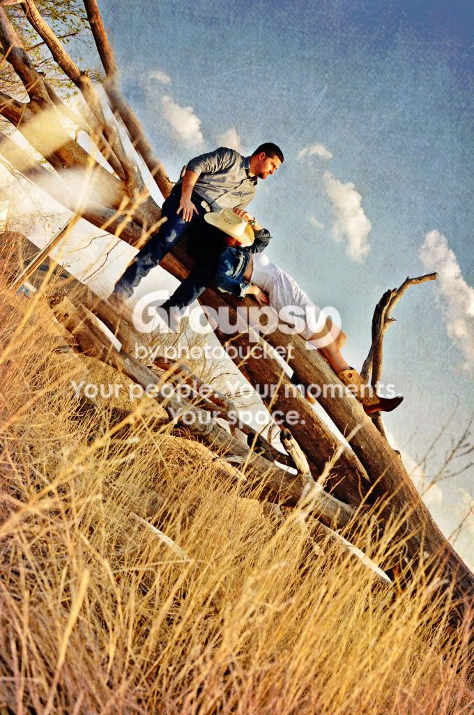
1. Looks like you composed the grass as the subject. Its distracting.
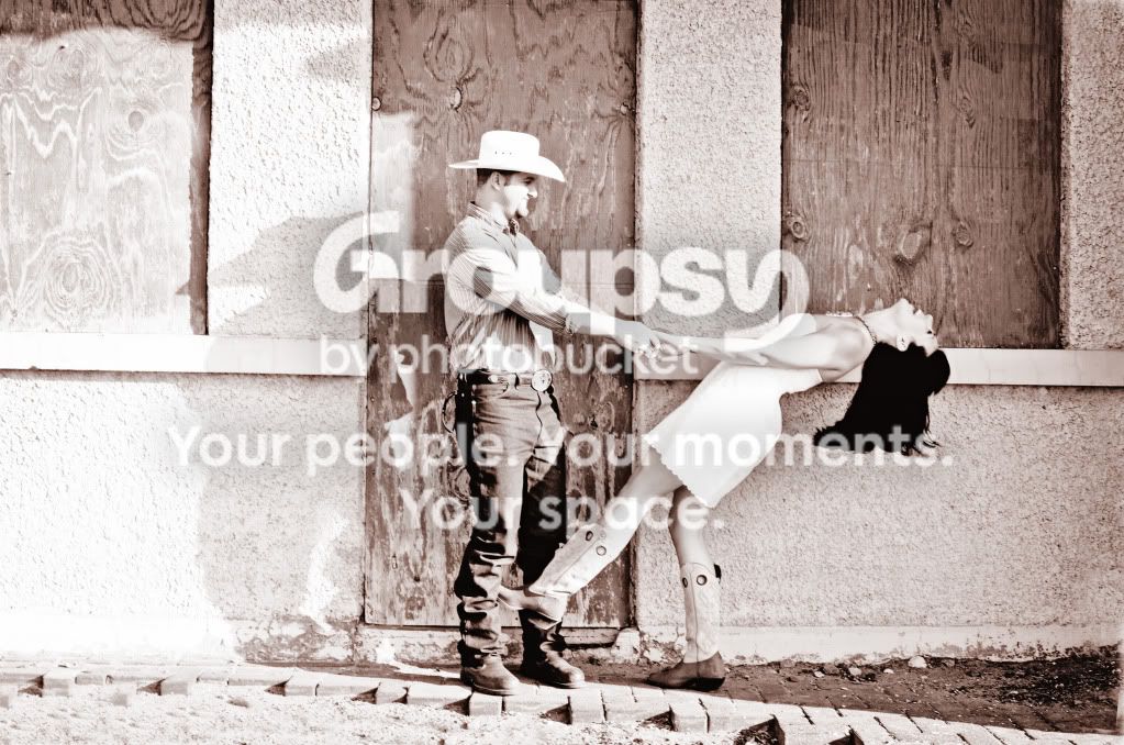
2.overexposed
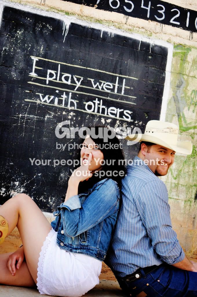
3. Why is she picking her nose? Out of focus.
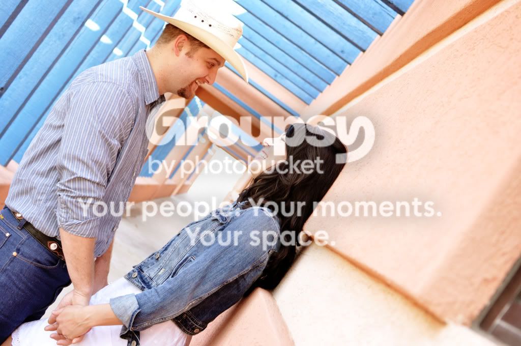
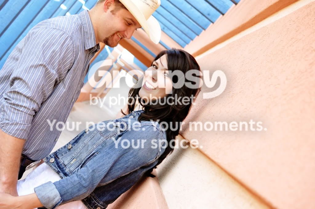
4&5. 45 degree crop doesn't really work well here. you cut off the guys had (cowboys don't like that), overexposed

except for #3 I like the posing in the photos and I like the locations in all of them.
 
Looks like you had some tough light to work with in some shots.

1. I like the edit and the texture you added to it. However, the angle makes me panic. I feel like she's going to slide off the log and I need to catch her!! :) It's a really neat pose and photo, though! I would just lose the tilt.

LIke I said, rough light but better then I could do in the circumstances!


1. I don't think the grass is the subject. It is anchoring the frame. It looks nice. This is not a "Hi MOM!" "Say Cheese" picture.. It is more of a candid shot, I'm not here, catching the moment....

What I don't like is the fakey texture. I could go for maybe a lower opacity of the texture, but the texture is distracting, way more then the grass....

2 & 3, same. overkill with processing.....

Not a fan of her picking her nose, but that is obviously what is comfy for the couple, so....

I like the other two.
 
The last two shots, with the extreme tilt could have been very nice photos...but instead we're treated to a huge expanse of wall on the right hand side of the frame. In the last shot, the tilt is extreme...and in the last shot, instead of seeing the cute white skirt she's wearing, and seeing them actually holding hands, the skirt is cropped out and the hands are cut off--all in favor of allowing more wall to be in the frame because the camera was tilted in order to create "some" type of "creative" effect I suppose.
 
I agree with the last OP..that last two could have been amazing photos, but the wall is a bit distracting and for me is the focal point. The first image I like and I dislike--I enjoyed the creative processing you did but I believe it may have too much contrast in comparison to the couple, and my attention is the grass, not the couple. The overexposure in the highlights in the second image I feel work for your capture, it brings more of their personality out. They seem like a fun loving couple. The third image I enjoy actually quite immensly, and feel it is your best photograph in your series, compositionally it may not be strong BUT the fact that you freely captured how much fun the couple has adds to it. That's what engagement photos are actually--they aren't who can take the most amazing photograph; but its how you capture your clients and how you can form a story of them and who they are in your captures. All in all--not too shabby but there's always room to improve---no ones god's gift at it.

 
No numbers on the photos, but IMO, in general your selection for camera frame orientation is exactly backwards in every shot.
 
I dislike the slant/tilt and honestly rarely seen it used properly. The concepts are decent, the execution missed.
 

Create an account or login to comment

You must be a member in order to leave a comment

Create account

Create an account on our community. It's easy!

Log in

Already have an account? Log in here.

New Topics

Back
Top Bottom