What's new

Engagement Shoot with friends

Tbini87

TPF Noob!
Joined
May 10, 2010
Messages
574
Reaction score
8
Location
Chico, CA
Can others edit my Photos
Photos OK to edit
Hey guys,
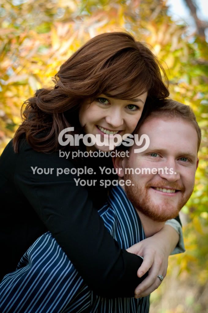
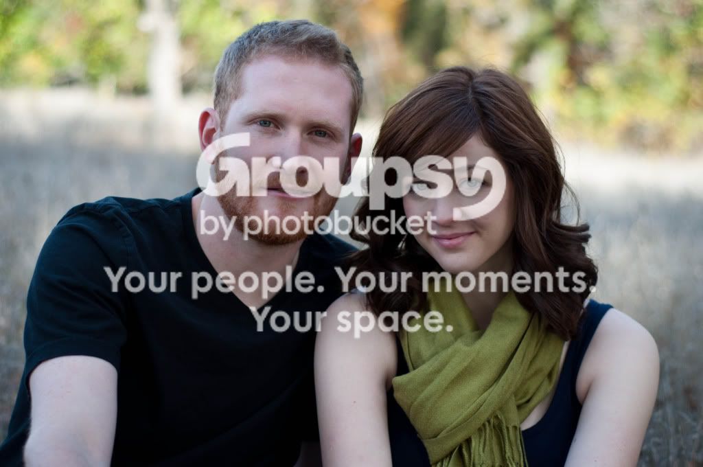
my wife and I got to do an engagement shoot for some friends this last weekend. We had a lot of fun. We shot in the morning and used reflectors when needed (though we are still not skilled at using them effectively). C&C welcome and appreciated!

1.
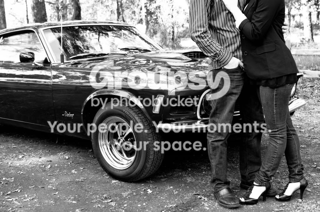
KristenDane-24.jpg


2.
KristenDane-68.jpg


3.
KristenDane-32.jpg
 
I like these.

A couple of thoughts.

1 - Not sure I like the composition here. With the heads cut off, it does not really say engagement to me. It is more a shot of the vehicle IMHO.

2- Like this one the best of the three, but it looks a little yellow to me. Maybe a white balance adjustment is in order.

3- The focus on this one looks soft and the image may be underexposed a 1/2 stop or so....some fill flash could have worked nicely here.
 
I like these.

A couple of thoughts.

1 - Not sure I like the composition here. With the heads cut off, it does not really say engagement to me. It is more a shot of the vehicle IMHO.

2- Like this one the best of the three, but it looks a little yellow to me. Maybe a white balance adjustment is in order.

3- The focus on this one looks soft and the image may be underexposed a 1/2 stop or so....some fill flash could have worked nicely here.

1. I wish we got her hand a little lower in the first image to show off her ring. Then it would say engagement a little louder.

2. I agree it seems a bit yellow. Could this be from all the yellow leaves on the trees and ground nearby?

3. We weren't using any flash, which we could have been (and we are sorting out our flash issues as we speak haha). We have a new SB-600 but haven't been putting it to use much yet.

Thanks a lot for the input.
 
Also, any general thought on the B&W edit? I think it is a really high contrast edit which I wish we toned down a bit. Whites seem too blown out to me. Anyone agree or does it work for this shot?
 
1. if that car has some meaning to both of them i would have had them at the front of the car , maybe holding hands w the emblem in between them. maybe thats a little cheesy, just a thought.
2. i like the most. love the colors of the leaves behind them. good focus.
3. def need a fill flash.
 
Is the fill flash needed to lighten up their faces compared to the background? Is it just too bland without a flash?
 
I like #1 a lot; it would reflect engagement if you could see her hand with the ring but eh . . . ok.

I would say 2 & 3 need a faster shutter speed too . . . and the fill flash.

But hey, keep it up!
 
no 2 is the best. The background is too bright though and you could fix that in photoshop. use the sponge and set it it desaturate at about 8% and run over the background Why was your F2.5? F5.6 would have been ample.

Here is my small photoshoping on it. Sorry it is crappy as I only spent a few minutes on it. desaturated the background and lightened her face up.

KristenDane-68.jpg
 
Last edited:
your skin tones are all over the place, not sure if its from editing or what. in image 2 her face has a yellow (probably from the leaves) tint and her exposed arm looks lifeless it looks so blue. His skin looks very flat. In the third one watch the arms, his arm needs to be out of the frame or covered by a long sleeve shirt. Her skin tone is more uniform but again she has no color in her face or arms and I find that hard ot believe thats what she looks like in person, and like others said fill flash to give them some life, it is very flat.

As far as the black and white one, scrap it. Their skin is blown out along with most of the background the car looks cool sure and if it has value to them it should have played a bigger role but all the highlights in the image make your eye jump all over the place, stopping down more and using a flash would really let you control the lighting.

Hope all this is okay, you did ask for critique
 
Thanks guys. I don't really know about why the skins tones are all over the place... I would guess it was from the different areas we were shooting in but not sure. I think the B&W was edited in high contrast which I think overdid it... I don't think their skin was blown out in the original image. Probably just poor editing skills on our part. We are working with LR3 and don't have Photoshop yet. I don't even know if LR3 has the sponge to desaturate the background tbh. Thanks for the critiques.
 
Your using an aperture that is too big to get enough DOF to get them both in focus, most look soft due to this
 
just keep shooting. If your shot from the camera isn't "right" editing will only work to a degree. Not saying this about your work but you know the saying doesn't matter how much you polish a turd it is a still a turd.. well to a degree it goes with this. Get your exposures and focus spot on and you won't have to really rely on editing. Just keep shooting and stay confident. :thumbup:
 
Why are most people gravitating towards #2 as opposed to #3? It's not because they look happier, although that does have an impact. It's because of the wardrobe. In #3, the bare arms are competing and winning the battle for attention instead of their faces. They are also square to the camera and do not help create that third dimension.

Just my 2¢.
 
I would add some saturation to the skin tones in #3.
 
Thanks so much guys. We did a shoot near the same place today and tried to use a little more flash and reflector than before, and were staying more in the f/5 range as opposed to 2.8ish. We are still learning every single day, and we had assumed we needed to be way down in the f/2s to be getting nice bokeh.
 

Create an account or login to comment

You must be a member in order to leave a comment

Create account

Create an account on our community. It's easy!

Log in

Already have an account? Log in here.

New Topics

Back
Top Bottom