nmasters
TPF Noob!
- Joined
- Dec 22, 2011
- Messages
- 209
- Reaction score
- 14
- Location
- Georgia
- Can others edit my Photos
- Photos OK to edit
Hello everyone!
I am part of my high school's photography club, and today the art teacher told us about a county art fair.
I showed her my latest photography, and she picked these four to consider entering in the fair. She said her favorites are 3 and 4. I want to make sure I can make these photos look their best before I email them to her.
All of my editing is done in Lightroom. Is there anything you would do different with the editing? Please feel free to edit my photos further. Thanks!
I realize I have posted some of these before for critique on my composition, hope you guys don't mind me posting them again.
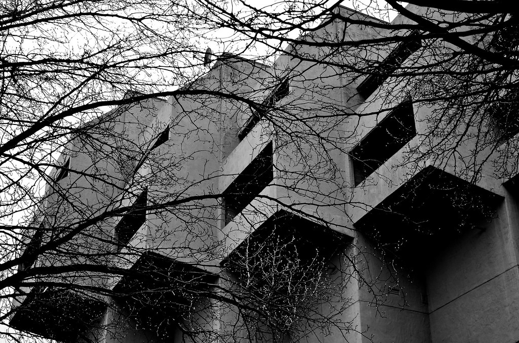
#1 I hate how the sky looks in this photo. I used the in-camera HDR feature (Nikon D5100). I tried my best to make it look more natural but no luck :x.

Dilapidated by nico418, on Flickr
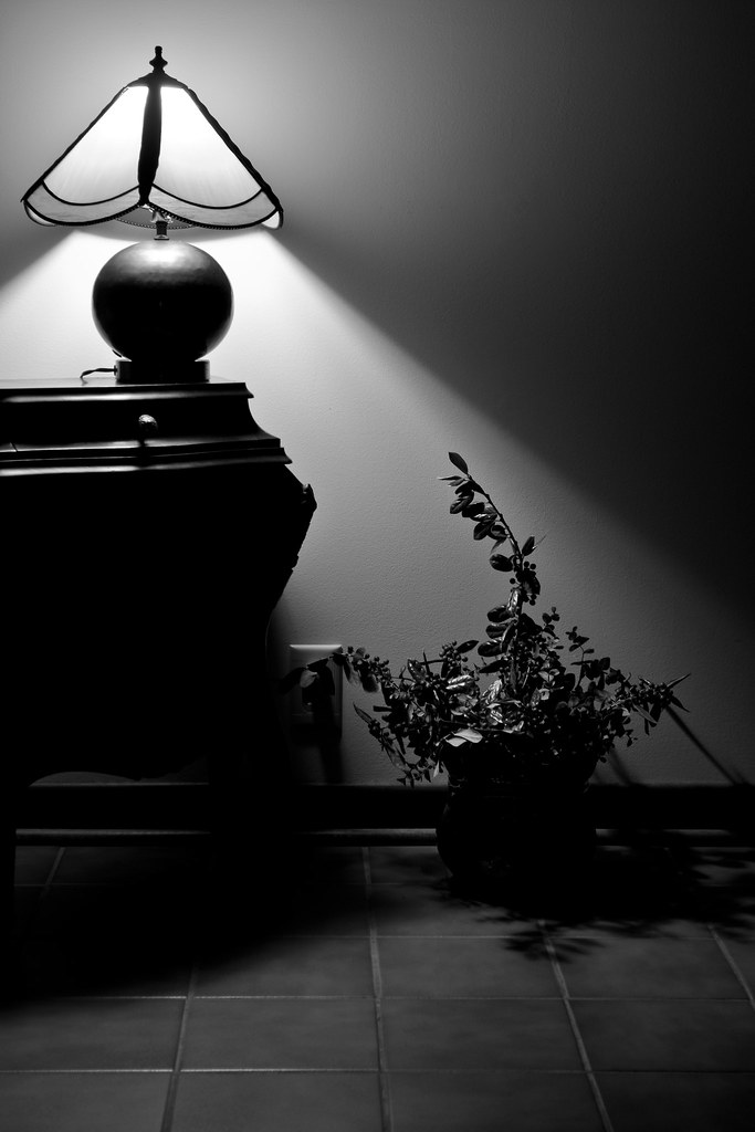
#2
Branch Out by nico418, on Flickr
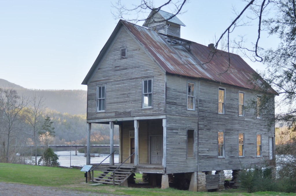
#3

Cracks by nico418, on Flickr
#4
Reach by nico418, on Flickr
I am part of my high school's photography club, and today the art teacher told us about a county art fair.
I showed her my latest photography, and she picked these four to consider entering in the fair. She said her favorites are 3 and 4. I want to make sure I can make these photos look their best before I email them to her.
All of my editing is done in Lightroom. Is there anything you would do different with the editing? Please feel free to edit my photos further. Thanks!
I realize I have posted some of these before for critique on my composition, hope you guys don't mind me posting them again.
#1 I hate how the sky looks in this photo. I used the in-camera HDR feature (Nikon D5100). I tried my best to make it look more natural but no luck :x.
Dilapidated by nico418, on Flickr
#2
Branch Out by nico418, on Flickr
#3
Cracks by nico418, on Flickr
#4
Reach by nico418, on Flickr


![[No title]](/data/xfmg/thumbnail/41/41902-e45a2db116295062060b22cde75818ed.jpg?1734176267)

![[No title]](/data/xfmg/thumbnail/41/41905-b622c7d92c817afea0d4f5704e7fb329.jpg?1734176270)

![[No title]](/data/xfmg/thumbnail/38/38261-db20f6f92ee8f0d4c5cf1536e308638b.jpg?1734172147)
![[No title]](/data/xfmg/thumbnail/38/38262-10a9668da9a2b36a92cddde57caf87bc.jpg?1734172150)


