Expiration of Inspiration/ C&C

Mo.

No longer a newbie, moving up!
Joined
Dec 30, 2011
Messages
175
Reaction score
35
Location
London
Can others edit my Photos
Photos OK to edit

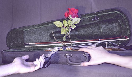
Expiration of Inspiration by Half an Eye Photography, on Flickr

I don't want to give too much away but this is cutting the hope string. But now a days music has been expired and most of the society has turned to all of the 'wrong' and 'meaningless' types of melodies.

This is my first conceptual piece and I've already noticed some flaws in it, but tell me what you think guys and how I can improve similar work in the near future.
 
Tight Knot said:
I don't like the colouring or shadows, but LOVE the concept.

I did try to make the image dull by using those colours, but what kind of colour theme do you think it would of worked better?
 
I find the purple very distracting, I think I would have used more of an "old cracked leather look" in shades of brown. But this is art, and everyone has different tastes and sees things differently. It doesn't mean your colours are wrong. A the artist, it's up to you to portray what you are feeling.
 
Yeah I agree. I guess I should of spent more time experimenting with the colours.
 
I disagree with your concept (good music is there if you look for it; there has always parts of a society that look down at pop music, usually older out of touch people), I like your attempt. The visuals confuse me a bit though.

The white balance conveys death/rotting, but there is a cut and healthy-looking fake rose blooming from a violin case. The arms look over exposed to take advantage of the deathly white balance, but yet they look alive and even in health condition despite the colouring.

Maybe it's above my head, but I'm not really sure what the message is. Can you enlighten us a bit further?
 
I see the violin case as a casket. But for that to work, you need to position the flowers either at the foot or the head of the case. A picture of you playing the violin positioned where the flower is would use the usual custom of placing the picture of the deceased at the cover of the casket. Colours work for me, given the idea you had, but I find the hand/arm positioning awkward. Not too sure where the scissors fit in.
 
What I can say about the concept is, obviously there is good music in every genre, however a lot of the music that get 'popular' now a days are the ones which include so little meaning.

The violin case and the violin it self is symbolising a coffin and the Rose is there to convey the message of that death across (maybe I should of positioned it better or had a real Rose).

I tried to make the left hand seem like it's dead whereas the second hand to be more spiritual. What I meant their was, after the instruments 'death', I have fallen as well. Although in my 'spiritual' context I'm still attached to the violin and I'd like to come back to it, if that makes sense.

The scissor is just my personal touch because I've had that violin for ages and failed to learn it for various reasons.

Hope that clears some stuff up bit thanks for the feedback. How else would you suggest for me to emphasise my hands better?
 
pgriz said:
I see the violin case as a casket. But for that to work, you need to position the flowers either at the foot or the head of the case. A picture of you playing the violin positioned where the flower is would use the usual custom of placing the picture of the deceased at the cover of the casket. Colours work for me, given the idea you had, but I find the hand/arm positioning awkward. Not too sure where the scissors fit in.

Ahh, yes the flower should of been there.
 
the bow is backwards :)

always place the tip of the bow inside the protective area, and the frog at the rear of the case.


i like the concept... i got the message from each hand, and felt that you were using the case as a casket.

couple thing i did not like:

the rose.. i like the rose itself, but i was very distracted by the curled stem. just doesnt belong.
the scissors: i understand what you were going for, but they were just distracting to me. they just feel like someone laid them there for no reason. maybe if they had been in a hand.. but as they are.. eh..

the colors.. i don't see purple. i see grey.. maybe i need to calibrate my monitor?

but i would think this would have looked better with some different processing. maybe like an old photo look, sepia tint, or with some garbage added to it, like hair, lint, specks, etc.. not sure how to descibe what i'm talking about.
 
naptime said:
the bow is backwards :)

always place the tip of the bow inside the protective area, and the frog at the rear of the case.

i like the concept... i got the message from each hand, and felt that you were using the case as a casket.

couple thing i did not like:

the rose.. i like the rose itself, but i was very distracted by the curled stem. just doesnt belong.
the scissors: i understand what you were going for, but they were just distracting to me. they just feel like someone laid them there for no reason. maybe if they had been in a hand.. but as they are.. eh..

the colors.. i don't see purple. i see grey.. maybe i need to calibrate my monitor?

but i would think this would have looked better with some different processing. maybe like an old photo look, sepia tint, or with some garbage added to it, like hair, lint, specks, etc.. not sure how to descibe what i'm talking about.

Haha, I was hitting myself for not realising it was backwards and I agree on the long stem too. And yea other props perhaps would of made it more interesting.

Thanks :)
 
I see what you are saying in the photo but WB and lighting would do wonders for this photo. I do like the idea behind it very much.
 
I dig the concept and I think you conveyed it in the photo.I think the problem is that you are trying to force too many elements into one photo; there's just too many ideas at once. Each element (scissors, rose, hands) could stand well on its own (alongside the violin, of course).Have you thought about doing a series instead of cramming everything into one shot? A storyboard or collage could include all the different, "simplified" images and wouldn't leave the viewer quite so overwhelmed.Keep working on this idea; the thought and inspiration is there, you just need to tweak your execution.
 
Ugh, sorry for the block of text. I really did utilize the return key... Damn iPhone.
 

Most reactions

Back
Top