1. Sharp, good colors, but ultimately pretty boring.
2. Really like this one.
3. Grainy, bad lighting. Overall, don't find this one interesting at all.
4. Slightly underexposed. I'd make some adjustments to make the yellow "pop" a little more.
5. Slightly underexposed also. Would like to see some of the stem on the flower on this one. The flower looks like an entirely separate object from the cup due to the DOF. Looking a bit awkward to me.
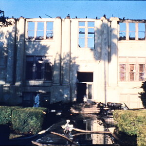
3 was in a really bad lighting situation. It was an art show and they were doing glass blowing. It is also a heavy crop.
I'm not making excuses, just explaining the situation.
Here's the other picture that turned out from the glass blowing.
Really like #2. It just jumped out at me. Love the lighting in that one. I like #5, has potential...but maybe a little more cropping action going on...
Really like #2. It just jumped out at me. Love the lighting in that one. I like #5, has potential...but maybe a little more cropping action going on...
I'm not sure why, but I seem to get my best pictures when I'm not trying. For example; I was waiting for someone to come out of a room so I stretched my legs in from of me and snapped two pictures of my boots, one with my jeans cuff up, and one down a little bit, and one turned out. Weird how that works...
1. I like this, mostly. I see why you kept it in a portrait crop; those colors on the bottom are nice, but I think I'd still rather see cropped just under that space with the three topmost leaves.
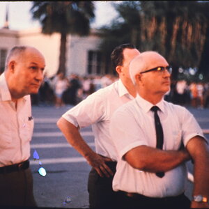
2. Interesting shot. Is he waiting for something? I like the colors, too.
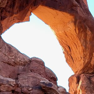
3. This seems like a difficult scene. To be quite honest, I'd have no idea how to go about shooting it!
4 and 5. They are really cheerful. I think they could be just a bit brighter, though, and that would make them better.
1. I like this, mostly. I see why you kept it in a portrait crop; those colors on the bottom are nice, but I think I'd still rather see cropped just under that space with the three topmost leaves.
2. Interesting shot. Is he waiting for something? I like the colors, too.
3. This seems like a difficult scene. To be quite honest, I'd have no idea how to go about shooting it!
4 and 5. They are really cheerful. I think they could be just a bit brighter, though, and that would make them better.
I really really like #5 - it would look great in my kitchen. As others have said - I would bump the color a little bit, brighten it and take a little bit of the contrast out. The petals look funky to me.
#4 Turn up the saturation and turn down the brightness a little..looks a little washed out to me.


")


![[No title]](/data/xfmg/thumbnail/42/42268-15c1c02cec1d71208987fc7c7ec7784c.jpg?1619740077)


![[No title]](/data/xfmg/thumbnail/38/38728-e8c32361443e4b671d8ef24d4dba6ef8.jpg?1619738702)