Fall Senior!!!!!

chmille

TPF Noob!
Joined
Aug 13, 2010
Messages
71
Reaction score
0
Location
Illinois
Can others edit my Photos
Photos NOT OK to edit
Hey everyone, So I had a senior session today. And winter is arriving soon, but some last images with that AMAZING fall weather, okay it was really winter weather in fall time, but yea. Let me know what you think. I'm open to anything you have to say, good or bad!

DSC_0045-2.jpg

DSC_0025-2-1.jpg

DSC_0004-2-1.jpg
 
Both the first and second would have highly benefited from some off camera fill flash to not only bring up the exposure on her face but give it a little bit of dimension...as it sits, the light in both is a little flat. Id try a little selective editing to keep the background exposure but bring hers up maybe 1/2-3/4 of a stop.

The third...the tilt is just too excessive considering she is just standing there with her arms at her sides. The entire thing looks really washed out.
 
thanks. I agree 1 and 2 most certainly could have benefited from off camera flash. however, I didn't have one :(
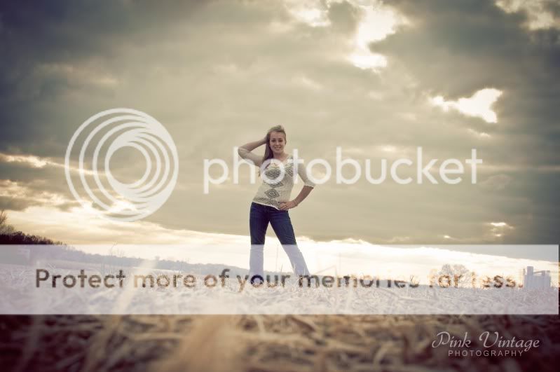
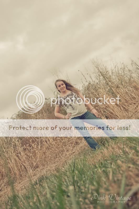
...anyways, I brought up her exposure, is this what you were thinking more? I didn't want to push it too much because then she looked as though she didn't belong in the image.

DSC_0044.jpg
 
I honestly like them as they are. Tilts aren't for everyone, but I like them in this set.

I also like the feeling - they have that under-saturated look and slightly moody feel, even with her smiling. Maybe she's not looking for the overdone saturation and contrast everyone is serving up nowadays in the senior market. I don't know if that was intentional or not, but it came out that way and it's kind of cool.
 
Pink Vintage
PHTOGRAPHY

Huh...the name alone is...well...odd,let's say. Even though I detest tilts, the one with her doing a handstand on the old railroad rail is decent, if not overwhelming. The rail makes a nice leading line to her, and the way she is against that dramtic sky and clouds is pretty good. Obviously that type of shot is not one for the yearbook, or grandma, but kind of rounds things out.

The name was after much debate, but instead of using a name I chose adjectives that describe things I like, a little of who I am, my interests. Also, I'm very big into textile work and I wanted something that I could use between both. So I could drop the word photography and use Pink Vintage as my textile work name. :)
 
The tilts are working against the shots, just me. Tilts are so overused, they have place for sure, but like so many other things, they get gimmicky.

The first , concept was good. Details in her hair etc are lost.

Second,too far away form the subject, and the hue makes it look very washed out.But I know thats what you wanted I guess?

Last one , exposure is way off.Again, the tilt is so out of place.

I agree with Jerrfy
 
Dodge some subtle highlights onto her skin in the 2nd two photos and it should look much less washed out. She is almost one with the background and needs to pop out a little. :)
 

Most reactions

Back
Top