What's new

Fall with 50mm (c&c please)

lyonsroar

TPF Noob!
Joined
Jul 7, 2010
Messages
1,255
Reaction score
99
Location
Omaha, NE
Can others edit my Photos
Photos OK to edit
#1


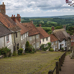
#2


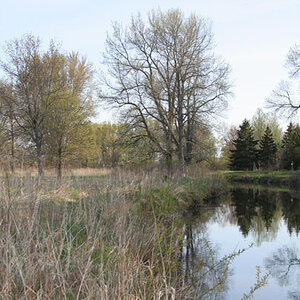
#3


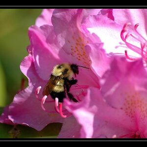
#4 (not sure about the PP on this...)


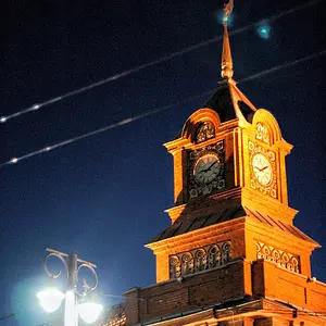
#5


Any of these do anything for anybody?
:thumbup: or :thumbdown:
 
I really love #4. All of them are nice, there's just something cute about 4.


Edit: Number 5 I'm digging too.
 
I like #1 and #4; it is a pity in #5 that lights are so visible.
 
I like #5 however I don't like the light at the end of the tunnel as it distracts from the subject. #1 is a nice perspective shot but I'm not wild about the subject. #2 I would have cropped in tighter on one of the flowers. Let it fill most of the frame. Good capture on #3. The color of the flowers has always been a tough one for me to capture. #4 nice capture but I would have cleared the cobwebs as they are a bit distracting. Nice job overall.
 
I like 4 & 5... 1 is not bad, but I think it could use a slightly larger DOF.

The one you posted of the scratched railing with Jess & David is also nice.
 
I like 4 & 5... 1 is not bad, but I think it could use a slightly larger DOF.

The one you posted of the scratched railing with Jess & David is also nice.

Thank you.

I like the first one because to get the shot I had to lay down in this dry fountain. Everyone was looking at me funny...:sexywink:
 
No one else?

Should I change my profile picture to a girl? Would that help? :lol:

Seriously. I'm just trying to improve...:hugs:
 
Although I dont know enough to CC you correctly, I'm going to tell you that I think you have a wonderful eye for what makes a great picture! I see a couple that I think would look great in frames in my room!
 
i like all of them. very beautiful. #5 is my favorite. the only criticism i have is that the DOF in 1's background is a little distracting.
 
I like them all. I'd crop the top off #4, the top part of the railing (vertical piece sticking up) is distracting to me.
 
I like them all, except the second, which needed either much more or much less dof. The selective focus on the first is just right - it forces you to look at the leaves in the corner and how they contrast with the oof background - any more dof would just make someone expect that the whole thing should be in focus. There are a couple of bright spots on one leaf that seem to lack detail - maybe try to bring some out in that area. Good selective focus on the graffiti shots also.
 
#5 i find brilliant.

youve got this dead, stone, almost grayscale foreground...go thru the tunnel...BAM...wonderful fall colors and light! i think its great how the colors have translated into the tunnel itself. great shot!
it is too bad about the lights, but it almost lends itself to the scene inside the tunnel.

really diggin it. :thumbup:
 

Create an account or login to comment

You must be a member in order to leave a comment

Create account

Create an account on our community. It's easy!

Log in

Already have an account? Log in here.

Back
Top Bottom