What's new

Family Portraits - CC on current style

Joined
May 18, 2014
Messages
111
Reaction score
81
Location
Guam
Can others edit my Photos
Photos OK to edit
So, I have recently adapted to a new style of editing my photos. Below is a few of the photos I think are the best, then there is a link to my current photo stream on Flickr. I'm mainly just wondering what everyone thinks about my photos over all. The skill level you may think I am at etc. This is all just for curiosity. Let me know what you guys think!

1.

2.

3.

4.

5.

6.


I usually would do all my editing in Lightroom but have recently started doing all my editing using Photoshop.

Let me know how you guys like the pictures, or if you think they are garbage.. I'm thick skinned so let me have it! =)
 
C&C per req:
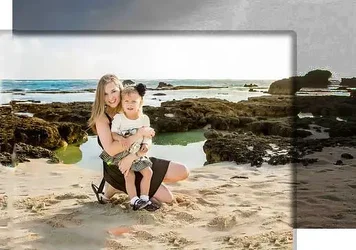
1. This is a cute shot; looks like one of those "turn around and there it is" shots. Two minor things that bother me: You've got Mom too close to the RH side of the frame, and the cars. If this was a shot you just grabbed, fair enough, you might not have nailed the framing, but those cars are easy to get rid of. Make them go away!

2. This is a nice, casual family shot, but IMO, a little too casual. I'd like to see some more refinement in the posing, such that the daughter was moved a little farther right in the frame and Dad wasn't quite so hidden. I also think having the daughter sit straight and Dad put his legs down would have helped. I get the feeling you posed them into the sun, based on their squinting (and yes, I know, almost everywhere on Guam is 'into the sun' :lol: ), but this doesn't make for the best images. Turn them out of the sun and and use supplemental light to bring some life into the eyes. Also, don't forget to level; this one looks about 3/4 degree down to the right.

3. Again details... using a polarizing filter would have brought the reflections under control and added some saturation. Using light would have allowed you to knock down ambient and keep detail in the sky, and lastly, watch your horizong lines. Just a slight change in your position and it wouldnt have gone through her head. Not a show-stopper, but not ideal.

4. As above for exposure. I would have liked the younger child moved just a bit to the right so that she(?) wasn't obscuring the older one's face quite so much. This would have allowed him to bring his head down and eliminated the reflection in his glasses. Also note the upper edge of the water going through his head.

5. I like the arrangment here. I would have perhaps moved the older girl just a bit farther left so that the spacing between her and Dad was closer to that of Dad to mother, and had Dad bring his leg down (Also note his hand. Fists/tightly clenched hands are rarely a positive element!). Again, heavy squinting...

6. Cute shot. I think again more light was needed to knock down ambient so we had some detail in the sky, and a polarizer to kill the reflections on the water.

Overall, these are nice images, and your processing style seems clean and straight-forward. I do think however you need to keep a closer eye on the small details of posing and positioning when shooting, as well as work on getting ambient light under control.
Just my $00.02 worth - YMMV
~John

 
1 - all of them a oversharpen
2 - first photo is the best ♥
 
Thanks for the detailed critique @tirediron. I have been trying to bring the sky back into my photos, been using a reflector. But to drag a bunch of lighting for family photos when kids are running around, that just doesn't seem like it's going to work ha.

I will definitely start paying more attention to the details though. Thanks!
 
Thanks for the detailed critique @tirediron. I have been trying to bring the sky back into my photos, been using a reflector. But to drag a bunch of lighting for family photos when kids are running around, that just doesn't seem like it's going to work ha.

I will definitely start paying more attention to the details though. Thanks!

You might consider sky overlays in Photoshop if you prefer natural light. Basically it's a bunch of high res photos of skies that you can mask into photos in which the sky is originally blown out.
 
Overall I like them. One thing for me, that hasn't been mentioned, is the big rock on camera left in number four keeps drawing my eye away from the kids.
 
I quite like these.. and they all seem consistent, which is good. I like the editing style.. they do seem over sharpened but I'd guess thats just a web thing most likely.

One nitpick from me is just watching horizon lines cutting right through people's heads.
 
It strikes me that you have a great deal of empty space in several of these that adds nothing to the impact and may actually detract.
In the first picture, the child is the center of interest and the mom is only really the support mechanism.
How about cropping tighter and losing some of the excess to fill the frame more.
Nothing that is useful gets lost (and perhaps warm it up a bit)

15866414642_b6c332ccc1_lllllllll.webp


and this one that looks like a framing error because there is so much non-contributing space on the top and they are so close to the bottom margin

(Sorry I didn't take a great deal of care with teh added sand, it could look a great deal better)

15716762477_a5b85a5cb3_klllllll.webp
 
I use to go in tight on a lot of my shots. I decided that since most people here that want their pictures taken, want them taken to capture the memories of living in Guam. That is why I go wider for some more so now, to show the surrounding areas.

I do very little sharpening of the RAW file in photoshop, so I will just chalk that up to it being a web thing haha.

Thanks again for the all the replies!
 
I use to go in tight on a lot of my shots. I decided that since most people here that want their pictures taken, want them taken to capture the memories of living in Guam. That is why I go wider for some more so now, to show the surrounding areas.

I do very little sharpening of the RAW file in photoshop, so I will just chalk that up to it being a web thing haha.

Thanks again for the all the replies!

Since I am a bit cranky, I will respond truthfully as I see it.
Looking at the pictures above, particularly the ones I cropped, framing them better would not lose anything 'scenic' except empty sky, a tiny bit of rock or a person's back.
They would end up being better composed.
 

Attachments

  • 15681562109_09f72ef520222222222.webp
    15681562109_09f72ef520222222222.webp
    28.5 KB · Views: 185

Create an account or login to comment

You must be a member in order to leave a comment

Create account

Create an account on our community. It's easy!

Log in

Already have an account? Log in here.

Back
Top Bottom