What's new

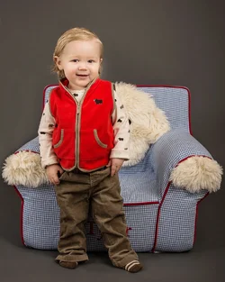
Feeling Like My Portraits are a Bit Flat - Please advise!

I used several different unsharp mask sharpenings at .5,5, 15, 30 radius on different areas (but really, really quickly)
If I had more time I would have done it a bit more carefully especially on the skin areas.
 
My take on it:

Photoshop - Adjusted eyes, catchlights, skin softness, added fill light to the right side, and added a touch of dodging and burning.

Lightroom - Sharpened with mask for edge sharpening, added contrast, and a touch of clarity.


You can edit this a dozen ways, but good lighting will always make this better SOOTC.
 

Attachments

  • $Tyler 2014-01 Portrait_Edit.webp
    $Tyler 2014-01 Portrait_Edit.webp
    463.9 KB · Views: 124
My take on it:

Photoshop - Adjusted eyes, catchlights, skin softness, added fill light to the right side, and added a touch of dodging and burning.

Lightroom - Sharpened with mask for edge sharpening, added contrast, and a touch of clarity.


You can edit this a dozen ways, but good lighting will always make this better SOOTC.

Yes, this looks "sharper", but the fundamental error is that this was cross-lighted. The kid's face, which is where we look, over and over and over, still looks flat, and dimension-less. Why? Because there are in effect, two "main lights", one on each side of the scene, with each light basically canceling out the shadows created by the opposite light. This is a fundamental beginner's error in lighting.

See the shadows created at the bottom of the chair, one identical shadow on each side? The light is coming from one side of the chair at the same intensity as it is from the other side of the chair. Same on his face. Same on his clothes.

That is not the way to light a three-dimensional subject that will be shown in a flat, photographic image. That is the way to light a flat,printed document on a copy stand, to cancel out all shadows. You can "goose" the image all you want, but the fundamental problem does not go away, it is just barely camouflaged, and only the dullest of viewers will buy into it. The boy still looks "flat", and dimensionless, no matter how much sharpening or contrast boosting is added. When the sharpening is jacked way up, it just looks like bad processing, with over-sharpening and a very bad "digital snapshot" look to it.

Placing two umbrellas, one on each side of a subject and angling in toward the center, is what this kind of lighting is. It never looks good because it goes against the fundamental "there is only one sun" thinking processes that we have deeply ingrained in our brains. Many people do not understand why they do not like this, and cannot put their finger on what it is that they do not like, because for the most part, they are unaware of how lighting typically actually works in the real world. It's a very low-level thinking process that is not being satisfied, and when we see something that is lighted by artificial lighting, either it is done "right" and it looks right, or it is done "wrong", and it looks "flat", or "off, in some way". This is one of the reasons that Hollywood movies have a lighting director, and huge staff of gaffers to rig lights, to create lighting set-ups that really look right, that really create just the right mood, and feel, and look.
 
Last edited:
A bit of sharpening o raise the local area contrast and I think it looks better

jqd4.jpg
Couldn't agree more.
Either you can use the umbrella in a different directions or you can go ahead with lightroom (software by adobe).
Hope that will help you.
 
That's why I said you can edit this a dozen ways, but good lighting will always make this better SOOTC.

I agree with everything you have touched on in your post, just wanted to help with an edit to further push an image past what it was currently at by the OP.
 
Last edited:
Placing two umbrellas, one on each side of a subject and angling in toward the center, is what this kind of lighting is. It never looks good because it goes against the fundamental "there is only one sun" thinking processes that we have deeply ingrained in our brains. Many people do not understand why they do not like this, and cannot put their finger on what it is that they do not like, because for the most part, they are unaware of how lighting typically actually works in the real world. It's a very low-level thinking process that is not being satisfied, and when we see something that is lighted by artificial lighting, either it is done "right" and it looks right, or it is done "wrong", and it looks "flat", or "off, in some way". This is one of the reasons that Hollywood movies have a lighting director, and huge staff of gaffers to rig lights, to create lighting set-ups that really look right, that really create just the right mood, and feel, and look.

When I first tried lighting for portraits I was doing the same and having the same problem. And got the same advice from you and others.

Here's a shot I took on xmas of my Mom with her two dogs: Mom with the dogs | Flickr - Photo Sharing!

I have an umbrella 45° off camera right, and a 20" Softbox as a fill 10° off camera right as well. If you look at the catch lights you can see it. Pretty happy with the result, the fill helps soften the shadows while still evenly lighting the scene but keeping definition and not going flat.
 
That's why I said you can edit this a dozen ways, but good lighting will always make this better SOOTC.

I agree with everything you have touched on in your post, just wanted to help with an edit to further push an image past what it was currently at by the OP.

Yes, I totally agree with you cconner, as you stated, "Good lighting will always make this better SOOTC" (straight out of the camera). I just had a few minutes, and thought I'd write out a few thoughts about why this photo looks flat, and why the original poster titled the shot, "Feeling like my portraits are a bit flat." The title of the post made me think that the OP was uncertain about why the portraits (plural) seem to be a bit flat.

If a person is new to studio lighting, and turns to the internet for suggestions, there are HUNDREDS of self-taught people doing lighting videos that show this same, cross-lighting set-up as being "the way to light with umbrellas", or whatnot. A few years ago, even Canon USA's instructional manuals diagrammed a two-light speedlight flash shot with this same type of cross-lighting, and even MIS-identified the lighting ratios. This was all covered in Chuck Gardner's on-line lighting blog, complete with an article discussing the poor lighting Canon itself was showing, and the mis-identified lighting ratios. SO...even "reliable" sources sometimes prove to be full of baloney in this, the internet age.

One of the most difficult things to overcome is poor instruction in the fundamentals. With so many people being self-taught, and learning on their own, at home, alone, and often using speedlights in umbrellas, with no modeling lamps to guide them, learning how and where to position the lights is many times a total,total crapshoot.

Today, we have many people who are attempting to learn very challenging things "alone", at home, in what I call "self-teaching". A lot of people get all bent out of shape when I use that phrase, self-taught. What I mean is that when a person learns "alone", at "home", without a mentor, without a really experienced teacher, that he or she is at risk of learning how to do things from other people who really are not all that experienced themselves. Cross-lighting set-ups are all over the internet, and this is what the OP is doing. Not assigning any blame, but pointing out that this method of lighting is GREAT for killing shadows, and making things like docments look perfectly flat, and one-dimensional, and it a good way to light when the goal is a flat, dimensionless recording of something like a watercolor painting that is to be copied and then made into a photographic copy print, or whatever.

 
That's why I said you can edit this a dozen ways, but good lighting will always make this better SOOTC.

I agree with everything you have touched on in your post, just wanted to help with an edit to further push an image past what it was currently at by the OP.

Yes, I totally agree with you cconner, as you stated, "Good lighting will always make this better SOOTC" (straight out of the camera). I just had a few minutes, and thought I'd write out a few thoughts about why this photo looks flat, and why the original poster titled the shot, "Feeling like my portraits are a bit flat." The title of the post made me think that the OP was uncertain about why the portraits (plural) seem to be a bit flat.

If a person is new to studio lighting, and turns to the internet for suggestions, there are HUNDREDS of self-taught people doing lighting videos that show this same, cross-lighting set-up as being "the way to light with umbrellas", or whatnot. A few years ago, even Canon USA's instructional manuals diagrammed a two-light speedlight flash shot with this same type of cross-lighting, and even MIS-identified the lighting ratios. This was all covered in Chuck Gardner's on-line lighting blog, complete with an article discussing the poor lighting Canon itself was showing, and the mis-identified lighting ratios. SO...even "reliable" sources sometimes prove to be full of baloney in this, the internet age.

One of the most difficult things to overcome is poor instruction in the fundamentals. With so many people being self-taught, and learning on their own, at home, alone, and often using speedlights in umbrellas, with no modeling lamps to guide them, learning how and where to position the lights is many times a total,total crapshoot.

Today, we have many people who are attempting to learn very challenging things "alone", at home, in what I call "self-teaching". A lot of people get all bent out of shape when I use that phrase, self-taught. What I mean is that when a person learns "alone", at "home", without a mentor, without a really experienced teacher, that he or she is at risk of learning how to do things from other people who really are not all that experienced themselves. Cross-lighting set-ups are all over the internet, and this is what the OP is doing. Not assigning any blame, but pointing out that this method of lighting is GREAT for killing shadows, and making things like docments look perfectly flat, and one-dimensional, and it a good way to light when the goal is a flat, dimensionless recording of something like a watercolor painting that is to be copied and then made into a photographic copy print, or whatever.

Please don't think I took offense....I appreciated the feedback and actually knew why I was getting this result. I just wanted confirmation. Possibly I should try my next shoot with a single strobe and bounce.
 
PeK77 said:
Please don't think I took offense....I appreciated the feedback and actually knew why I was getting this result. I just wanted confirmation. Possibly I should try my next shoot with a single strobe and bounce.

Pek77, No, I did not think you took any offense. I've been dabbling with studio lighting, off and on, since 1986. I just wanted to pass along some thoughts on it, and some observations I've made over the decades of watching the use of "off camera lighting" go from exceedingly rare, to slightly uncommon, to the state where it is today, with sites like Strobist just YESTERDAY having distilled their Lighting 101 course into a free, on-line PDF format document!

You did not seem offended at all, but a lot of times things written with one intent seem very harsh or critical on-line. I look at TPF as a place for learning, and for the sharing of information, experience, and viewpoints.

This video is interesting in the way it shows just how MUCH of an area a single umbrella can light. As I mentioned, in smaller rooms, one umbrella can create its own main light effect, AND can also create fill light based on the spill light it creates. I have seen similar issues as the one you posed when baby and toddler photos are made in low-ceilinged rooms, and the spill light from one, or two umbrellas creates soooooo much shadow fill-in that the lighting lacks a really easily-seen directional quality.

 
Last edited by a moderator:
Get rid of the furry white prop. It's distracting and the kid blends into the background because his shirt is also white. Changing the lighting won't help.
 

Create an account or login to comment

You must be a member in order to leave a comment

Create account

Create an account on our community. It's easy!

Log in

Already have an account? Log in here.

Back
Top Bottom