What's new

Fence Line

PixelRabbit

A naughty little bunny...
Joined
Nov 28, 2011
Messages
6,593
Reaction score
3,719
Location
Ontario
Can others edit my Photos
Photos NOT OK to edit
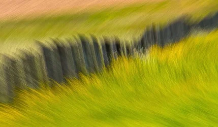
Today on our way to pick up my prints I was focusing on fence lines, this is my favourite of the bunch.

Would love to hear your thoughts, thanks for taking a look!


Fence Line by Judi Smelko, on Flickr
 
That has "win" all over it.
 
It has nice feel and color. I would crop the bottom so the dark area is more center.
 
It has nice feel and color. I would crop the bottom so the dark area is more center.

I like where it is, because three major lines in the photo meet up with each other, alternating directions, and occur in about equidistant sections. There is a lot of symmetry in this photo, and it's very satisfying to me.
 
It has nice feel and color. I would crop the bottom so the dark area is more center.

I like where it is, because three major lines in the photo meet up with each other, alternating directions, and occur in about equidistant sections. There is a lot of symmetry in this photo, and it's very satisfying to me.

I'm on the fence here.

But I am tipping towards losing a bit off the bottom.
I think it has more to do with it being almost square, but not quite.
Conversely, I'd like a little off the left to make it square.
 
It's like photo impressionism. Very nicely done. I like the leading lines, the swirl, but I do agree about cropping a bit off the bottom.
 
PR, this is very nice - an impressionistic photo blur. I do think that I agree with cropping a bit off the bottom.

WesternGuy
 
I like the warm feeling the photo conveys, and agree with the bottom cropping. Definitely nice work.
 
Don't crop it little bunny. The lower left corner has that rush of relatively straight lines that leads the viewer into the composition. If you continue on, this is the type of thing you learn to recognize if you train in the arts. I like the way you use your toys.
 
I like it as is, but agree that a bit cropped off the bottom would make it even better.
 
$14453605336_57ca1f7ec9_b - Version 2.webp

I hope you don't mind my fooling with it. I thought it needed a flip and a tilt. Line in a composition tends to be more positive if it rises to the right, and by placing more of the dark mass lower in the frame, it tends to stabilize the composition. The crop was only to square it off after tilting.
 
I like it as is PR. Wouldn't crop at all. Nice work :)
 
Beautiful original shot. As commented, the edit took too much texture and openness.
 

Create an account or login to comment

You must be a member in order to leave a comment

Create account

Create an account on our community. It's easy!

Log in

Already have an account? Log in here.

Back
Top Bottom