Onemarshboy
TPF Noob!
- Joined
- Aug 21, 2009
- Messages
- 97
- Reaction score
- 0
- Location
- London
- Can others edit my Photos
- Photos OK to edit
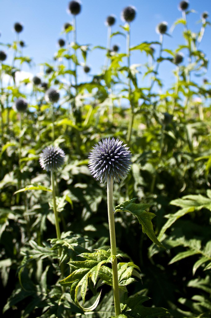
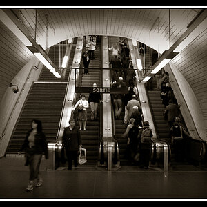
went out shooting with the new camera this weekend.....got some reasonable shots....still lots to learn tho.
Thanks for looking,
Rob


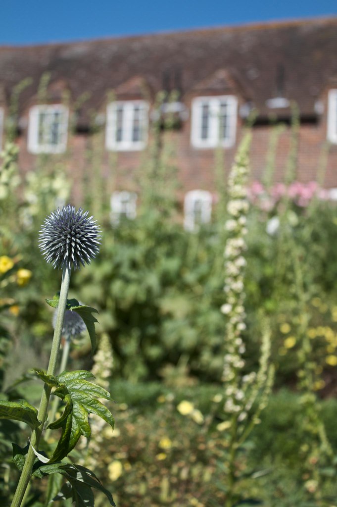

Thanks for looking,
Rob


![[No title]](/data/xfmg/thumbnail/41/41920-c7de4d93604fb89eb48454f9e5dba8a0.jpg?1619739944)
![[No title]](/data/xfmg/thumbnail/42/42487-e35b2848c41aeeb5a93f21809f036a1d.jpg?1619740196)