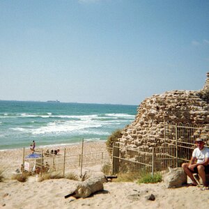
Fine Art? Bah!

D-B-J

Been spending a lot of time on here!
Joined
Apr 13, 2010
Messages
9,027
Reaction score
2,175
Can others edit my Photos
Photos OK to edit
Well, I tried. Thoughts?

While visiting with family at Toddy Pond in Maine the fog started rolling in, so I set up and started shooting. This shot is what I had in mind, and came out exactly as I wanted. I love when that happens.

Nikon D800
Nikon 16-35 f4 VRII
Circular Polarizer
Lee 0.6 GND Hard
Lee Little Stopper


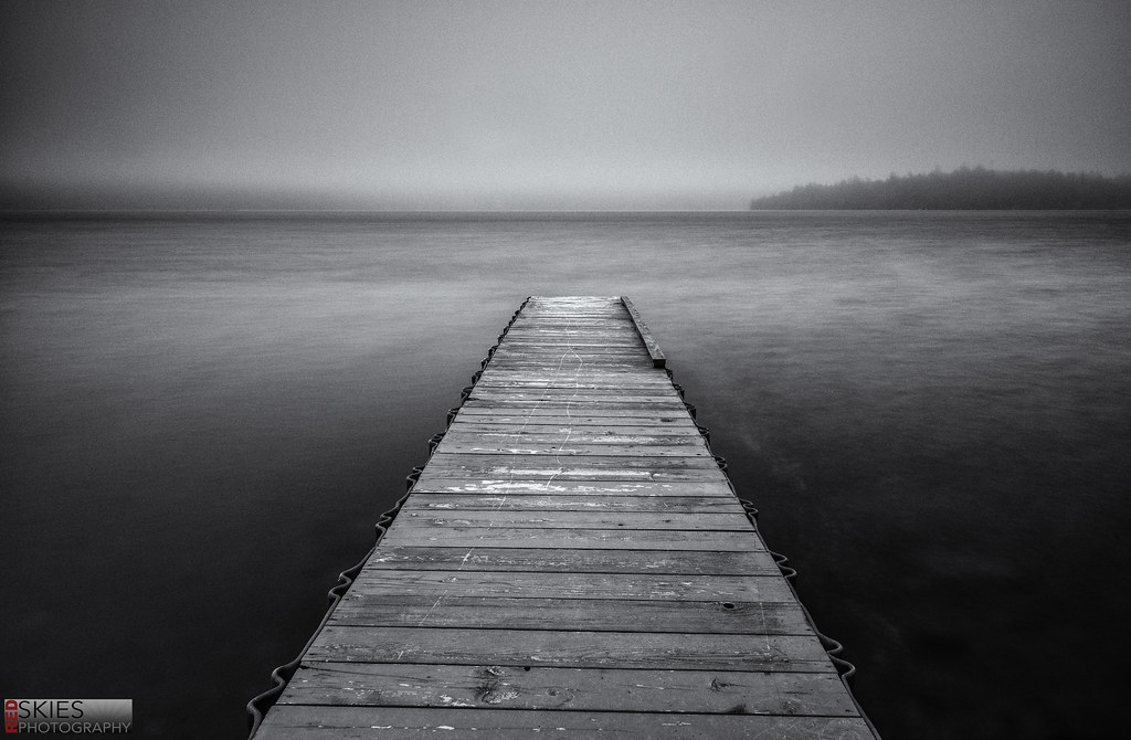
Lead Me by f_one_eight, on Flickr


Cheers!
Jake
 
Not too bad. Your logo has become a strong element of the composition. It has pretty nice balance really. The only nit I would mention besides the logo is the overly dark burn in the upper-left corner and the lower right corner...that much burning looks a bit contrived in this very stark, realistic, straightforward type of scene. But otherwise, yeah, I totally,totally 'get' your concept here. Good decisions on balance,nice horizon line placement, and a very simple composition, very formal except for the island or peninsula (headland!) in the distance.

This photograph does have a kind of "fine-arty" vibe to it. If it were part of a series with some similar images, and printed large and matted and framed, people would probably really dig it, and the accompanying images that reinforced its visual language. I think this is a perfectly valid and enjoyable rendering of this type of a scene!

I'm, interested in what you would say that it was, exactly, that you "did" to create this. What do YOU see that you willingly "did" to make this shot?


I simple meant that I had wanted a dock with smooth water and fog, and I made that happen. Don't read into it, as there's nothing to read into. Thanks for your kind words.. and yeah. The logo can be rather stark on a B+W.

Jake
 
Thoughts?
This shot is what I had in mind, and came out exactly as I wanted
.

Apparently it's perfect then. :1219:
Personally, I would like to see more fog


I see what you're saying, but I wanted the dock to be the focus of the image, and not the fog.

Jake
 
The dock is crooked, yet not quite crooked enough to look intentional so now it bugs me. Now that I've pointed it out to you it'll bug you too. ;) :lol:
 
The dock is crooked, yet not quite crooked enough to look intentional so now it bugs me. Now that I've pointed it out to you it'll bug you too. ;) :lol:


Oh I know it is. I thought about fixing it in PS... But real life isn't perfect. Things are crooked. So I'll leave it, for now.
 
Any shot that has fog or the subject centered in the photo, is automatically considered fine art. Don't let anyone else tell you differently.
 
It is nice when things work as planned. That's usually good enough for me. Well done!
 
It has promise but you got to blend the background more with the dock or blend the dock more with the background. The sharp contrast is not working here.
 
Very nice! I love how you added noise/grain to this. Assuming so, since it was shot at iso250?

But yes, nicely done on creating 'fine art'.
 
Very nice! I love how you added noise/grain to this. Assuming so, since it was shot at iso250?

But yes, nicely done on creating 'fine art'.

Yeah I used silver efex's push process preset which added some grain to the image.

Thanks for the kind words!

Jake
 
It has promise but you got to blend the background more with the dock or blend the dock more with the background. The sharp contrast is not working here.

I'm not sure I follow.. Blend how?
 
Just like all your work, I love it!

Oh I know it is. I thought about fixing it in PS... But real life isn't perfect. Things are crooked. So I'll leave it, for now.

Wabi-sabi. I personally like it the way it is.
 
Just like all your work, I love it!

Oh I know it is. I thought about fixing it in PS... But real life isn't perfect. Things are crooked. So I'll leave it, for now.

Wabi-sabi. I personally like it the way it is.


Wow, thank you! That means a lot [emoji106]
 

Most reactions

New Topics

Back
Top