What's new

Fine art photo critique ?

Ircam

TPF Noob!
Joined
Jul 23, 2014
Messages
9
Reaction score
1
Location
Strasbourg, France
Hi guys !

Could you give me some advices/feedback on those pictures please ? The exif data are available on Flickr, clicking the picture will take you there.
All shots taken are with my D3100 and 18-55mm kit lens, all edited in LR.

#1

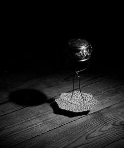
Tea Filter par LucasLeroy, sur Flickr

#2

Buckle Frame par LucasLeroy, sur Flickr

#3

Murder at breakfast par LucasLeroy, sur Flickr

#4

Coffee grinder par LucasLeroy, sur Flickr

#5

Guitar & Pick par LucasLeroy, sur Flickr

#6

Spices on Wood par LucasLeroy, sur Flickr

Thanks in advance !
Lucas
 
Last edited:
Bienvenue, Lucas. Your exposures are good, your exercising the use of selective focus, and you are using your imagination, all good things. That does not necessarily add up to fine art, which is a pretty powerful term, imo. I don't see fine art.
 
"spices on wood" should be called "a spice on wood", you chose to present it that way... composition might be better

do you have anything specific you want us to tell you?
 
Lucas,

I agree with Keyseddie, you are using imagination, vision, and creativity. They are all technically sound (except for Buckle frame) in my opinion. Tea Filter is my favorite, then Murder at Breakfast. Good job, keep it up!
 
Very nice. I like this kind of images.

Last image - suggest switch place between the green and the white stuff and focus there.
 
Thanks all for the feedbacks !
As for the categorization of fine art, I agree, it's just that I don't know what other category that kind of photographs could be.

mmaria : I don't have anything specific I want you to tell me, I just posted those pictures to have a general critique really, all that comes in mind of more experienced photographers. Alright for the title, to be honest I kinda set it quickly, but indeed now that you point it out, singular might have been better in relation to the photo.

benp2k6, thanks for your words of encouragement ! What isn't good about Buckle frame ? Is it that the buckle in the foreground is too big and distracting ?
 
Thanks all for the feedbacks !
As for the categorization of fine art, I agree, it's just that I don't know what other category that kind of photographs could be.

mmaria : I don't have anything specific I want you to tell me, I just posted those pictures to have a general critique really, all that comes in mind of more experienced photographers. Alright for the title, to be honest I kinda set it quickly, but indeed now that you point it out, singular might have been better in relation to the photo.

benp2k6, thanks for your words of encouragement ! What isn't good about Buckle frame ? Is it that the buckle in the foreground is too big and distracting ?

Abstract :wink:
 
They are well done but sort of empty in that they don't go anywhere, there is no mystery or implied story.
Strangely the composition is mostly good but the framing is odd and in several there is a real disconnect between the objects that is less inviting than it is off-putting.

for example, why are we looking through an OOF buckle at the text on the cover of a book #2
why is the junction of the shadow and spoon out of the frame when it is a lovely design element #3
why are we so close to the unexceptional dial on the coffee machine with the bag of coffee so OOF that it could be an ash tray?

and so on.

you are doing well technically but I think deeper thought on what and why you are showing us would help?
 

I disagree.

Abstract will make the viewers see different things, and usually not what the actual object is.
 
I am with Lew, but think technically you actually overdid. I think you are really fascinated with shallow DoF. That's OK, yet I think overusing it does more damage than good. Shallow DoF is very good in bringing up the the subject "forward", but starts to be a problem if cuts of parts of the story and sens of the picture (#4 and 6). In any case placement of sharp zone of the picture in essentially soft picture undergoes the same "rules" of composition like everything else in order to produce pleasant picture (#6). I personally don't like non sharp objects in the front of sharp main subjects. As in #3 it is a small problem, in #2 it is mighty distracting. Actually #3 is in my opinion the best idea and most interesting. Conversion to b&w is not an automatic success, rather the opposite. #5 is too flat and as a result... too flat. Maybe in colour version would look more interesting ? #1 has the most interesting subject, but you drowned it in too big shadow (in proportion to the size of picture). How about this crop ?
$Tea Filter_crop.webp
 
Last edited:
good idea, Timor.

I think that tea thing is misplaced in the frame.
My eye goes in left to right (as most Western eyes do) along the grain and then the shadow goes off to the left and beyond the tea pot is nothing.
If it is flipped and our eye goes along with the light and then follows the shadow into nothing.
I think it needs more space at the bottom and the right.

00ca50.jpg
 
I prefer the vertical aspect ratio.
 

Create an account or login to comment

You must be a member in order to leave a comment

Create account

Create an account on our community. It's easy!

Log in

Already have an account? Log in here.

New Topics

Back
Top Bottom