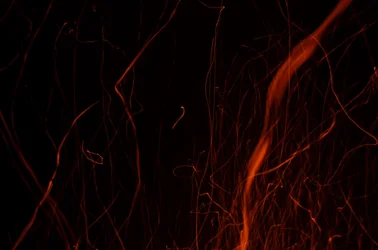
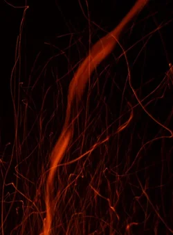
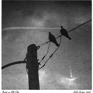
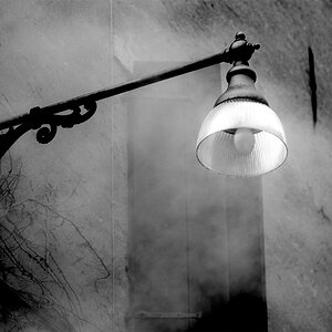
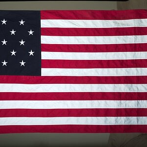
There's a corner-to-corner diagonal, which is one of the basic gimmicks for.. uh.. "creating a sense of dynamism" or something.
I prefer the original crop. It's less trite and obvious, the lines have a little more room to breathe. I generally like me some negative space. Neither is REALLY my thing, though. Abstracts are hard.