Good luck fighting the "tone mapping is not HDR" fight

I am more of a descriptive linguist than a prescriptive one, myself.
What are you going for here, cpeay?
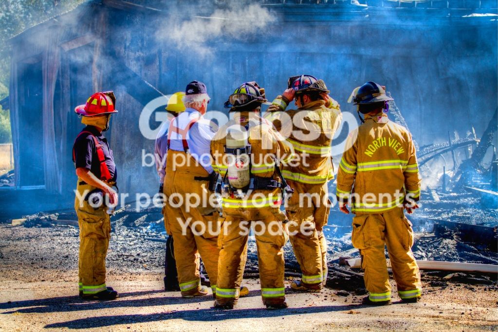
You appear to have pulled some detail out of the burned structure, which is interesting to look at. It looks a little odd in terms of the light, as these tonemapping exercises often do, but I get that it's a thing and people like it. Why are the firemen all kind of neon and hypersaturated? This doesn't make any visual sense to me -- I feel like they're perfectly well separated from the background without really any help, and I'm not feeling any reason in terms of the image for making them day-glo. The vivid colors clash with the rest of the feeling of the scene -- I get a sense of "job well done", "job finished", "tired", "resting" from the scene, and the POW of color isn't really playing well with those ideas.
Maybe you're going for a superhero reference here? That might make some sense, but I'd like to see some more action/dynamic feeling in the scene to go with that.
To be honest I assume you're going for a "but it looks cool!" thing here, which is a thing in its own right, I guess. But maybe you're not! Who am I to judge?







![[No title]](/data/xfmg/thumbnail/37/37618-4cd08d553e4ce30fd49570b1ba8259f2.jpg?1734170743)

![[No title]](/data/xfmg/thumbnail/37/37619-ccc825bbe41ff30b1d1e808dec8d6932.jpg?1734170744)