first attempt at portraits C&C please

jarhead2042

TPF Noob!
Joined
Jan 2, 2010
Messages
76
Reaction score
0
Location
zanesville,oh
Can others edit my Photos
Photos NOT OK to edit
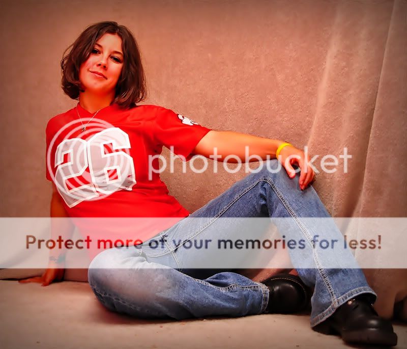
a friend of mine asked me to do some portraits for her..this is my first attempt at ever trying this...just looking for some input on how to do them better..she picked all the poses all i did was the pictures

the room wasnt very big at all...7 foot ceiling and maybe 8 foot by 9 foot...i used a d3000 with a 18-200mm lens not sure of the f stop iso was around 200, vivitar flash bounced off the white ceiling...do they look to soft after some editing or are my eyes just messing with me after little sleep

DSC_0006.jpg


DSC_0004.jpg


DSC_0003.jpg


DSC_0002.jpg
 
first thing i notice is the white balance
 
Drew Barrymore? Haha. Yeah man, you're white balance is way, way off.. the image is showing up all red..
 
Yes, too warm colours are the first thing we all note here, and then with a sorry sigh I saw her nice, lively pose in 3 ... and the fingers of her near hand all cropped off :(. That's a pose where definitely all her hands should be inside your frame.

The last looks VERY softened in post. Too much, to my mind.

And I'm not really sure about her pose in 1? Crotch shot??? Hmmmm :scratch: ...
 
Yeah, her skin looks too soft IMHO. To me, skin looks best more natural, so I can see the pores, hairs, freckles and whatnot. I clone/heal out zits or whatever, but otherwise I try not to alter skin into some other kind of texture.

Much more noticable though: Her skin is way too red/orange. So much so that she's got pinkeye and yellow teeth. That color cast is the first thing that jumps out at me. Looks like a shadow/highlight edit went a little too far on some areas as well. I'd say tone down the reds in post so that they don't glow nuclear as a first step. Her shirt may have influenced the color of the whole scene by bouncing red light everywhere, and that's how they turned out because of it. That said, you may want to use a cool filter in post to compensate.

Even though it's a small room, you really need to get her away from the background for better separation and to create a nice bokeh if you possibly can, even if that means shooting in a different room/place. Also with the background, choose colors that don't blend in with the model's skin or clothing. With the dominant red shirt, the color of this background is too much in the same range of the color wheel for good separation.

Avoid cutting off fingers or other appendages, especially near or on joints.

The negative space behind her (to our left) in #2 is confusing to me. Whatever's included in the composition I take as something that the photographer wants me to look at, and in this case, there's nothing there for my interest. If you're going to use negative space, it usually works better if the model is facing into it instead, unless there's something of interest the other way.

Associated with that, there's a bit more room over her head and to the left in the last shot than is necessary. There's nothing there of interest and I can't see how it adds to the composition, so I'd crop it down to a more standard portrait comp.

The faux blur in it needs work too. In #4 as an example, it's still got some pretty bad sharpening/compression type artifacts on the right side of the frame, and around her hair. This goes back to getting her away from the background so that you don't have to resort to trying to get that look in post, which can be difficult to do and still have it look like natural bokeh.

If you just can't get your models away from the backgrounds, concentrate on learning some real good masking techniques in post.
 

Most reactions

New Topics

Back
Top