First band promo

DeepSpring

TPF Noob!
Joined
Jul 12, 2006
Messages
1,451
Reaction score
0
Location
Los Angeles
Website
www.joshualights.com
Can others edit my Photos
Photos OK to edit
So my band is going to be in the schools newpaper and we didn't have a shot worthy of the paper so we decided to take one. Thing was we had one day and being that I shoot on film for the time being I had to do a 1 hour photo which I hate. The colors came out horrible and there was an insane amount of grain on 400 iso. So I tried a bit of stuff on photoshop to maybe use that bad quality to try and give it that "old look". Since I am in it I had to compose it, set the timer, and run up onto the roof really fast. So how do you think I did?


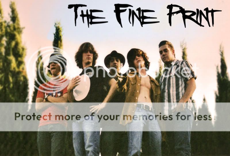
EDIT: I uploaded the first draft by accident, a few places in this one the tree is not blurred so ignore that


Roof-color-smaller.jpg
 
It works. Overall I don't think the PS or the grain are a big deal. In band promo shots you can get away with a lot of things that aren't technically sound, depending on the look the band wants.
 
Thanks for the replies.

Yeah teh grain could be waaayyyy less but as said in a band situation this kinda thing can pass as "creative on purpose" kinda stuff. The only thing that is really bugging me is the lower left hand trees, thats how they look on the prints not just a scanning issue.
 
Actually, the grain doesn't pass, if they are going to be using this in a press kit. A publication generally won't use something this grainy, as it will reproduce poorly.

I would suggest breaking them up a bit as well, rather than having them kind of in a straight line. It's hard to make a promo shot dynamic, but that helps a bit. And even once you tell bands, I find you have to keep reminding them, and I see lots of shots when I'm editing where they've kind of migrated back to lining up in a row.

Maybe a touch of fill flash to make their faces show a little better, as well as coming in a bit tighter...after all, you want to show the band, right? ;-)
 
The grain doesn't bother me to be honest. I remeber when grain on 400ASA film was the size of footballs! It does have a 70's feel to it, which look like what you were trying to acheive.

Very good job I'd say :thumbup:

So which one is you? The one on the right I recon? ;)
 
DianaPrice said:
Actually, the grain doesn't pass, if they are going to be using this in a press kit. A publication generally won't use something this grainy, as it will reproduce poorly.

I would suggest breaking them up a bit as well, rather than having them kind of in a straight line. It's hard to make a promo shot dynamic, but that helps a bit. And even once you tell bands, I find you have to keep reminding them, and I see lots of shots when I'm editing where they've kind of migrated back to lining up in a row.

Maybe a touch of fill flash to make their faces show a little better, as well as coming in a bit tighter...after all, you want to show the band, right? ;-)


Kind of interesting, both points you mentioned as negatives, grain and all in a row, are evident in at least some of your work on your website...for example your portrait called "james3" is rather grainy, and your promos of "zombeast" have a couple all in a row. ;)

You have some cool stuff on your site....or rather, I guess I should say, how did you put it? It doesn't.....suck. :mrgreen:
 

Most reactions

Back
Top