What's new

FIRST C&C Please be honest

Jesemanuel

TPF Noob!
Joined
Aug 12, 2011
Messages
28
Reaction score
1
Location
Puerto Rico
Can others edit my Photos
Photos OK to edit
So here are a few of my photos, I hope they aren't too bad. But I'm no expert that's why I'm asking for critique, so I can learn from my massive mistakes. So here they are:

1. IMG_0483 by Jesemanuel, on Flickr
2.
IMG_0784 by Jesemanuel, on Flickr

3.
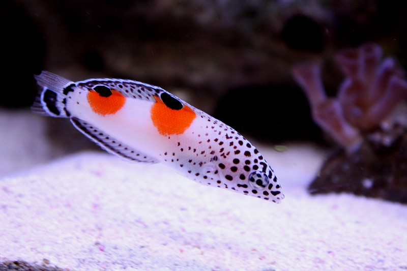
IMG_4669 by Jesemanuel, on Flickr

4.
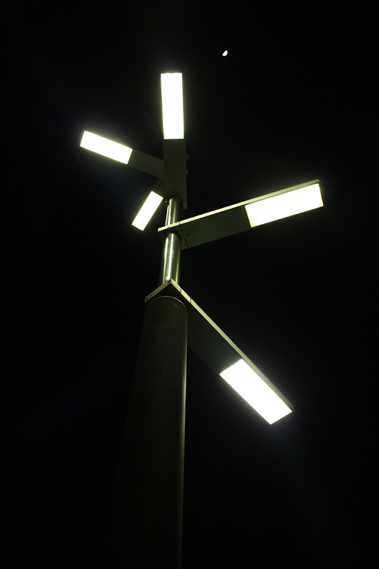
IMG_2863 by Jesemanuel, on Flickr

5.
IMG_1957b by Jesemanuel, on Flickr

RIGHT!!!! So that's what Im going to post for now, let me know what you think of it, and please be honest with me. Hope to hear from you guys soon.
 
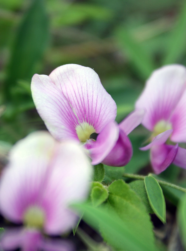
I don't like how the closest flower is the blurriest in #2. It's too much blur for such a large area of the picture, and it's distracting.

#4 has an interesting subject but the picture itself is sort of bland. It actually confuses me, because I find myself both interested in and bored with the picture. Simultaneously. Very strange.

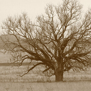
#5 is nice, I like it a lot. My only suggestion would be to take a step or two back so the outer limbs aren't cut out. It would be neat if the bushes in the background weren't there, but not much you can do about that I suppose.
 
I am certainly not a pro and that being said...

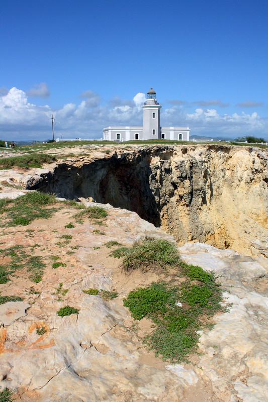
1. I think it would be better if you cropped out a lot (not all) of the foreground before the hole.
2. It is a little out focus. Could stand to be sharper. Even your subject is off a bit.
3. This is better. The sand is somewhat overexposed but with the dark background not sure what yo could do. Maybe someone else could weigh in.
4. Doesn't do much for me.
5. Looks good. Best of the bunch. Would like to see it in color.
 
Oddly, I think 4 has the most potential from a standpoint of knowing that you saw that and thought it was interesting. Most of your shots were somewhat "whatever", but 4 ... and, in truth, 5... showed a spark of artistry.

BTW, fish shots aren't easy, so you should be proud you got that one as well as you did.
 
Awesome guys thank you for the C&C, and I welcome more people to get involved, so if you are reading this post now feel free to add more :)
 
To tell you guys the truth, the first two were taken a day after I bought the camera :) so I really didn't know what I was doing. Just a little back story to those pictures :)
 
I absolutely love number four! That may very well because have a fetish for lights at night time.
 
Nice start...keep on trying...you need to look on the web for some sites on composition...and have a look for Bryan Peterson's book, Understanding Exposure and you may want to have a look at Chris Weston's book - Nature Photography.

#1. ...way too much foreground, it is very distracting if the building was the main subject. If you can shoot this again, try a different angle if you can.
#2. I think you are trying to get too much in one image capture and the fact that so much of it is out of focus detracts from the image.
#3. Not bad, the sand is a little blown out - I could go into a long explanation of what I might do, but that is way beyond this forum...
#4. Not sure what it is or whether it is inside or outside - so no comment.
#5. Nice silhouette, but you have cropped off the "branches" on the side. B&W conversion also looks good - how did you do it?

My 0.02¢ for what its worth...

Cheers,

WesternGuy

Well I have the original photo (#5), I can fix the cropped branches with a few steps back, and I did give it a b&w filter effect with the cameras computer program. I have a Canon EOS Rebel XS. The tree itself was already grey so I thought to go with a B&W theme here. I would also comment that the sand in #3 was white to begin with, I wouldn't mind getting a few tips on that.

Also, #4 is an outdoor photo, its a lamp post in a scenic area here in Puerto Rico :) The small white spec above it, is the moon.

By the way thanks for the critique :)
 
keep shooting you need more practice. kinda dig the light photo though.
 
Nice start...keep on trying...you need to look on the web for some sites on composition...and have a look for Bryan Peterson's book, Understanding Exposure and you may want to have a look at Chris Weston's book - Nature Photography.

#1. ...way too much foreground, it is very distracting if the building was the main subject. If you can shoot this again, try a different angle if you can.
#2. I think you are trying to get too much in one image capture and the fact that so much of it is out of focus detracts from the image.
#3. Not bad, the sand is a little blown out - I could go into a long explanation of what I might do, but that is way beyond this forum...
#4. Not sure what it is or whether it is inside or outside - so no comment.
#5. Nice silhouette, but you have cropped off the "branches" on the side. B&W conversion also looks good - how did you do it?

My 0.02¢ for what its worth...

Cheers,

WesternGuy

I picked up a copy of Understanding Exposure today because I remembered it being mentioned here....but this one is by a different author. :( This one is by Andy Stansfield. It looks like it will be useful, though, especially since I'm a noob.
 
Watch your foregrounds. Foregrounds should have interest too and shouldn't be OOF. None of these pics have enough interest to grab my attention, but #5 is the best of your set. Nice silouetting.
 

Create an account or login to comment

You must be a member in order to leave a comment

Create account

Create an account on our community. It's easy!

Log in

Already have an account? Log in here.

New Topics

Back
Top Bottom