Although it is implied, I would like to mention that this is just my opinion, nothing else:
First off, thanks for your input!
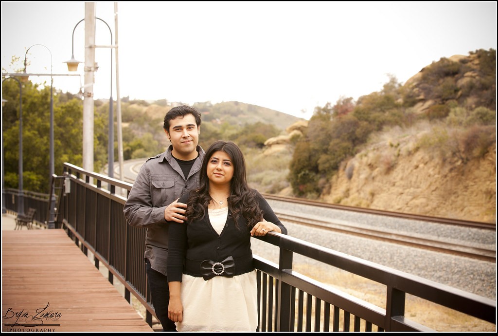
Image 1: Posing of the girl could have been improved by avoiding the right arm to just hang... Also the sky is blown out too much. I like theie expression and general feeling but they seemed a little tense. Also, if would have been possible, I would have avoided those poles and the street lamp.
I totally agree with you on the posing of the girl. I tried continually to get them to relax but maybe I just wasn't making my directions clear enough, I definitely have to work on trying to make the subject(s) more at ease and comfortable. As for the tense feeling, I think it has to do a lot with their personalities. They're both very camera shy. I actually wanted to include the poles and street lamps. This was taken at an old train station that was converted into a museum so I really wanted to get that train station feel to it.
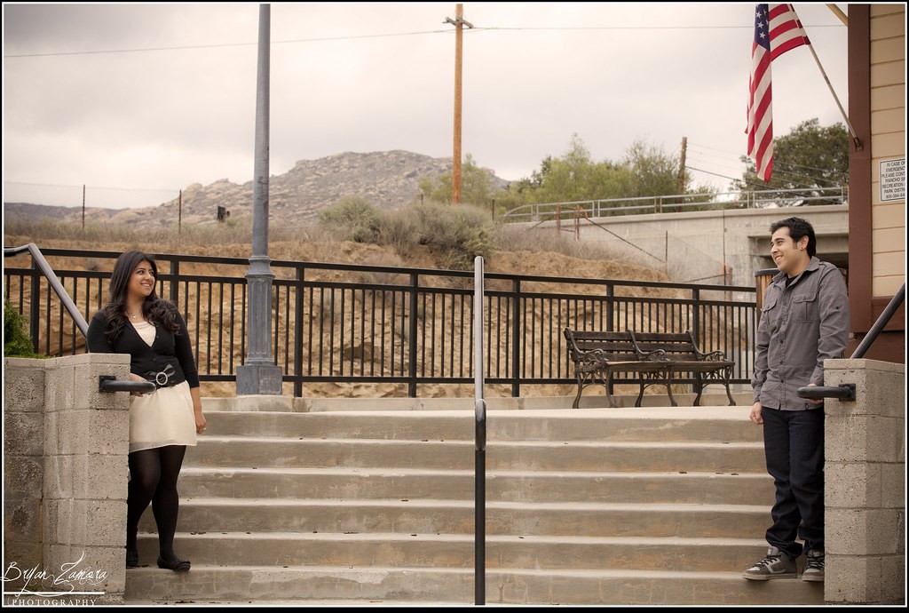
Image 2: Good idea but the idea was not expressed properly. The metal bar between them is arguably a good element but the clutter behind with poles and wires is a definite no for me. I would not have chosen this for the client...
Gotcha. Again, I wanted the poles to be in it for the train station feel. But I agree it could have been executed better.
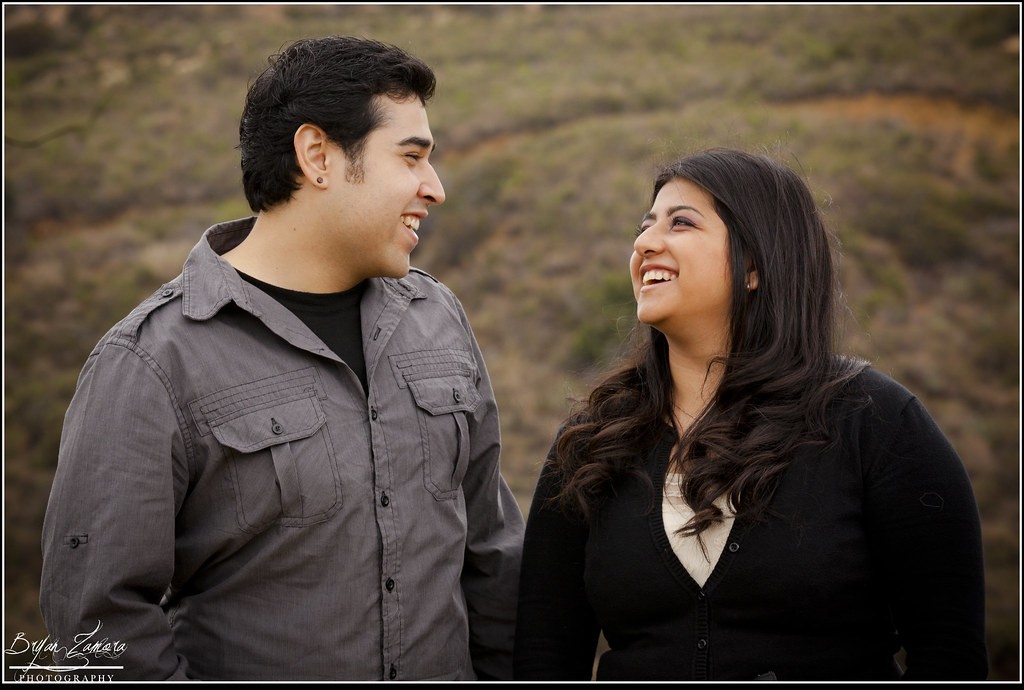
Image 3: I very good one! I love it: good expression, nice mimics, very good skin tone, good composition. I would have corrected the lint on the left arm of the girl - nothing else.
The lint! I saw that and meant to correct it, damn it! haha I'll definitely fix it though, can't believe I forgot.
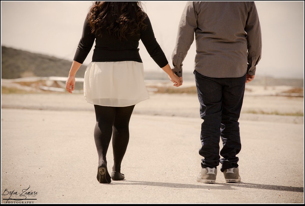
Image 4: A good image also. I can see however that you had directional light available and chose to place it in front of the subjects and you shot from behind. If the light was too harsh it was probably a good decision but if not, the directional light wold have brought more depth to the image and more texture detail. Also, I would have shot dozens of photos while they were walking in order to get one with both of them in clear motion - the guy looks like he's standing not walking like the girl.
Yeah, I would have liked to face them the opposite way but there was an ugly green fence in the opposite direction so I decided to go with what the photo shows. I actually had quite a few of them actually walking but was not as happy with any of them. I felt this was the best one, but yeah, I wish he would have placed one foot forward.
I would also like to add that the photographer should get involved in the way the subjects dress for the shoot. Of course, within limits... Their outfits may represent their personalities but do not really match...
Hm, I didn't think of that. I just told them to wear something nice that they haven't worn yet. I should've told them to match. Good tips, thanks!
I hope you take this the right way as I have no intention to trash anyone's work.


![[No title]](/data/xfmg/thumbnail/33/33449-978bff23ad40c63da778b7e59d54f546.jpg?1734163488)
![[No title]](/data/xfmg/thumbnail/31/31977-2b717e032201241cbeae8226af23eba4.jpg?1734160754)
![[No title]](/data/xfmg/thumbnail/37/37113-886cb28b1e3fb197bdd00a9148269407.jpg?1734169831)


![[No title]](/data/xfmg/thumbnail/33/33448-e22f202a6b3be7233dba294543198f2e.jpg?1734163486)