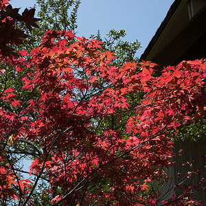
I like how #1 is balanced. I also like how the thin stems in the foreground give meaning to an otherwise abstract blob-like (<< is that a technical term?) background. I think it's strong. I would crop the dark stem peeking in on the lower right corner.
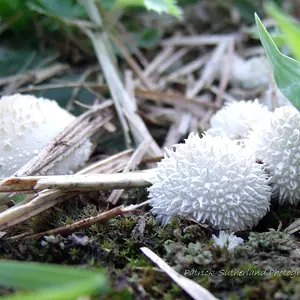
In #2, the silhouette is nice and bold. The sky is on the over-exposed side, but it doesn't bother me. What are those bright spot highlights on the lower right?
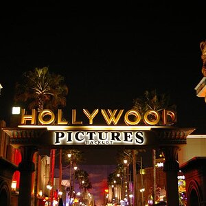
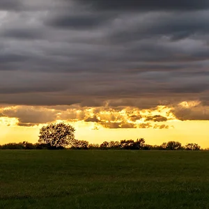
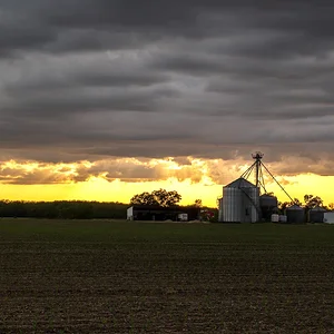
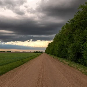
The only thing i like about #4 is the colors. The composition is very left heavy, and it makes me want to tilt my head to the right so left is down. I like the micro irregularity of the horizon line and it's relationship to the irregular trees. Little details like this, whether intentional or not, attract my attention, but overall, the composition doesn't work for me.
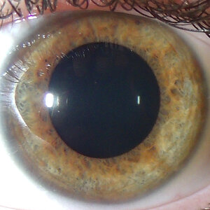
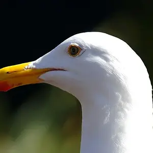
Yeah, I skipped over #3, cause I'm not sure how i feel about this one yet.



![[No title]](/data/xfmg/thumbnail/39/39419-5d4fd8535ab4f6e01caa38b72bf396e0.jpg?1734173503)