
Heather Koch
No longer a newbie, moving up!
- Joined
- Oct 10, 2014
- Messages
- 652
- Reaction score
- 155
- Location
- Michigan
- Can others edit my Photos
- Photos OK to edit
I'll link my original thread here for people who want to see it for information...
Advice - Model Photographing... | Photography Forum
We went out today around 3:30 PM and it was an overcast day, with some sun. The lighting was perfect.
Here are some shots I took, will post more as I edit them. Let me know your thoughts and critiques")


Advice - Model Photographing... | Photography Forum
We went out today around 3:30 PM and it was an overcast day, with some sun. The lighting was perfect.
Here are some shots I took, will post more as I edit them. Let me know your thoughts and critiques


 DET_1693oldpolar
 DET_1693memory
 DET_1614oldpolar
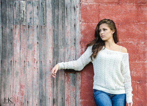 DET_1555orig

![[No title]](/data/xfmg/thumbnail/37/37520-d3e4d6582aa2781be7abf64e8651db45.jpg?1619738128)


![[No title]](/data/xfmg/thumbnail/37/37521-5e19cc15e190997d963ed09c3c13ca9c.jpg?1619738129)