What's new

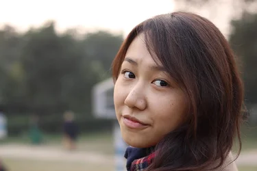
First Model Shoot!

$DSC_0006.webp
 
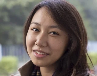
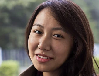
I believe that you need to look for what you are trying to emphasize and make that important and minimize what draws the viewer away from that.
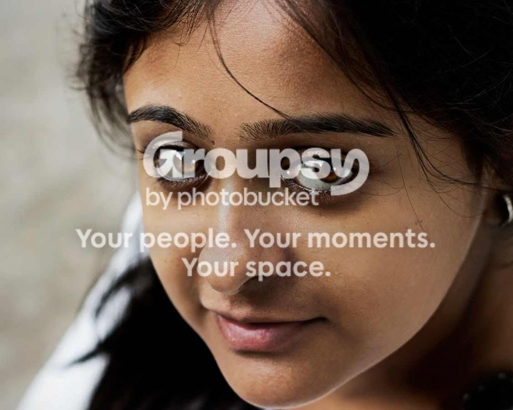
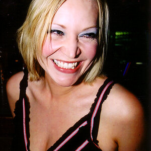
Crop to get the attention where you are looking, her eyes and upper face. Then minimize the skin problems/issues that are transient (she will notice the loss of a scar but not the loss of minor pimples)
This looks too bright to me so I toned it down some; I also darkened the bright light areas on her nose.
A little color balancing and a tiny bit if brightening the mid tones to finish

IMG_5569ii2222222_zps05599b54.jpg
 
learn some more on the Rule of thirds. This helps in compositioning. You should get use to looking around the edges of your viewfinder. If you look at the second to last female, she has a light coming out of her head. small things that you could easily change. Also the skin looks a little yellow. You have nice models to learn from and great locations. I love the close ups, I tend to style that way too. but try to include a little more. For instance include just above the bust lines to the top of the head for head and shoulders. For your three quarters, include just slightly below the hip line. Notice on your last one she has no hands. I tend to place the hand closest to the camera on top to fully see it. Just some c&c i see.

Another thing to look out for is the eye placement. In your shots, the iris is way to far to the left or right. just a slight turn of the head and a little tilt will put those babies in the sweet spot and make your images speak!

great job!
 
I believe that you need to look for what you are trying to emphasize and make that important and minimize what draws the viewer away from that.
Crop to get the attention where you are looking, her eyes and upper face. Then minimize the skin problems/issues that are transient (she will notice the loss of a scar but not the loss of minor pimples)
This looks too bright to me so I toned it down some; I also darkened the bright light areas on her nose.
A little color balancing and a tiny bit if brightening the mid tones to finish

Much thanks for helping me out here!
I have to learn about framing and cropping a lot!

How about this?

$DSC_0015.webp
 
I believe that you need to look for what you are trying to emphasize and make that important and minimize what draws the viewer away from that.
Crop to get the attention where you are looking, her eyes and upper face. Then minimize the skin problems/issues that are transient (she will notice the loss of a scar but not the loss of minor pimples)
This looks too bright to me so I toned it down some; I also darkened the bright light areas on her nose.
A little color balancing and a tiny bit if brightening the mid tones to finish


Much thanks for helping me out here!
I have to learn about framing and cropping a lot!

How about this?

View attachment 32389


What I think when I see lots of space on the side (with nothing of interest and no artistic reason for it) and the head and chin clipped, is that the photographer was making a mistake and shooting in landscape orientation.

Compare this one with the first, where the space to her right is sort of natural because her face is partly turned away and so there is a sort of artistic balance.
Here her face is straight on, she is choked at the bottom and clipped at the top. This is awkwardly up close as opposed to the first that has an interesting angle and a definite attempt to center on her eyes.

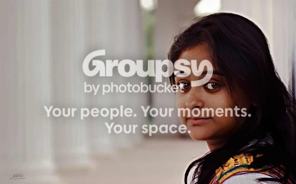
I like this one below the most for a couple of reasons.
She has a lovely sweet, innocent look and she is clearly sharing the attention with the space beyond her, although it isn't in focus, as if this space is somehow important.
It is a difficult exposure problem because her skin is dark and her hair is just inky and yet the background is bright.
I would definitely crop off that bit of wall at the right and lighten her face a bit and her hair enough to give it some detail.

That halo around her head is present in the original and may be an artifact from prior processing.

tumpa-1lllll_zps8ac02eb7.jpg
 
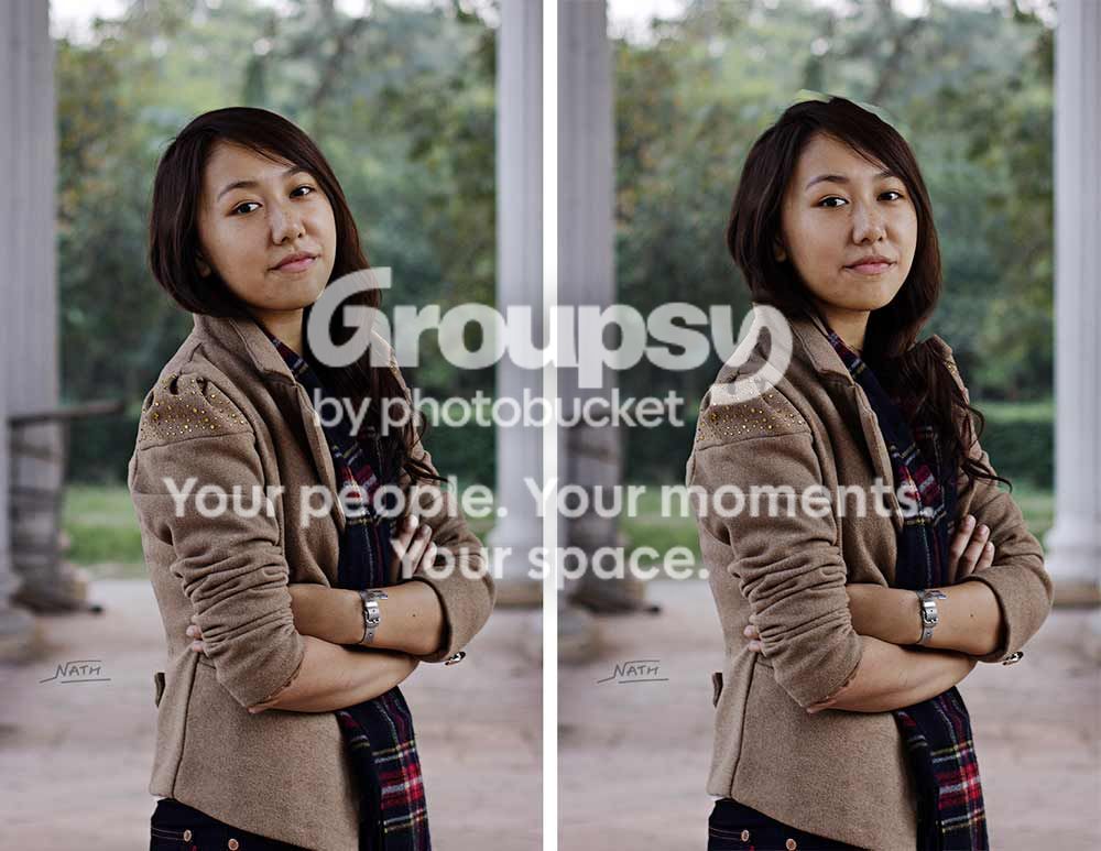
And on the standing one, why is her head tilted back and why is there so much room above her head?
I think anything that looks unusual should have an artistic reason.

padmadual_zpsada61292.jpg
 
And on the standing one, why is her head tilted back and why is there so much room above her head?
I think anything that looks unusual should have an artistic reason.

thanks for your reply,gotta work on cropping and taking pictures in portrait config!

I try to follow rule of thirds most of the time


any link to videos helping in cropping and configs to take pictures?
 
It's not so much the rule of thirds and cropping tutorials, per se... but I'd suggest looking through as many c&c's of portraits on here as you can find.

Before you read the comments, form your own opinions, and find the REASONS WHY for your opinions. THEN read the comments.

It's about composition, posing, balance, subject, points of interest, the use of light in general, and the interaction with the model.

There are "rule books" out there, and there are how to guides... and they are useful. But (and please try to take this in the helpful spirit in which is intended) as someone in an overly rigid indoctrinated culture, you might be better served by intentionally avoiding reading the "rules" and instead try to pick up these things organically in bits and pieces, through learning to appreciate good, bad and improving photography as art and to judge it for yourself.

Your eye as a consumer of photography will help guide you as a producer.

 
^^^^ makes sense.

Critique based on rules doesn't do much to help your own taste grow.
Reading rules (guidelines) might help a bit but the most important thing to do is to cultivate your eye, to understand why some things look better or more natural.
Look at pictures, try to dissect them to see how your eye moves around, what it looks at, what is pleasing then compare that to what others say and try to grow from that.
If what others say makes sense to you visually, ignoring the rule' crap, then tuck that bit of knowledge away; if it just seems like rote response, keep it in a 'maybe' corner.
 
It's not so much the rule of thirds and cropping tutorials, per se... but I'd suggest looking through as many c&c's of portraits on here as you can find.

Before you read the comments, form your own opinions, and find the REASONS WHY for your opinions. THEN read the comments.

It's about composition, posing, balance, subject, points of interest, the use of light in general, and the interaction with the model.

There are "rule books" out there, and there are how to guides... and they are useful. But (and please try to take this in the helpful spirit in which is intended) as someone in an overly rigid indoctrinated culture, you might be better served by intentionally avoiding reading the "rules" and instead try to pick up these things organically in bits and pieces, through learning to appreciate good, bad and improving photography as art and to judge it for yourself.

Your eye as a consumer of photography will help guide you as a producer.
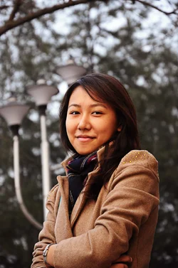
Thanks,I did see the CC of the portraits threads here and tried to implement!
there were no posing here,my friends called them over and me too!they were taking pictures and I was observing and took pictures where I thought there is a pic

most of the shots you see here are candids actually with no posing at all
I took like 100 shots and only handlful (7-8) came out the way I wanted it to be!

Sure there's a long way to go

regards! I may have some pictures I may like! will upload them soon!

Thanks for commenting and giving me feedback!
 
^^^^ makes sense.

Critique based on rules doesn't do much to help your own taste grow.
Reading rules (guidelines) might help a bit but the most important thing to do is to cultivate your eye, to understand why some things look better or more natural.
Look at pictures, try to dissect them to see how your eye moves around, what it looks at, what is pleasing then compare that to what others say and try to grow from that.
If what others say makes sense to you visually, ignoring the rule' crap, then tuck that bit of knowledge away; if it just seems like rote response, keep it in a 'maybe' corner.

yeah exactly!i really dont follow any other rle as such except the rule of third,as it gives the subject more room (correct me if wrong) and makes it look aesthetic
I really appreciate every single feedback I get here!on facebook and on flickr all I get is likes and thanks for sharing comments!

$IMG_5610.webp


also would like to know if there is a pic in this?
 
The only thing i would strongly suggest you try for yourself is this:

When composing "tight" (up close), try using portrait orientation.
When using landscape orientation, try composing looser.

Try it and see the effect it has on your results.
 
Also, if you are going to be / want to be working with models, you will have to start learning about hair, makeup, wardrobe, accessories, and styling.

With models, these elements help move you from taking snapshots to being a photographer.

Both of these models could have benefitted from some makeup, hair, and/or wardrobe styling.
 
Also, if you are going to be / want to be working with models, you will have to start learning about hair, makeup, wardrobe, accessories, and styling.

With models, these elements help move you from taking snapshots to being a photographer.

Both of these models could have benefitted from some makeup, hair, and/or wardrobe styling.

Regards,will follow your suggestion but these are my friends! :wink:

will try to do so!

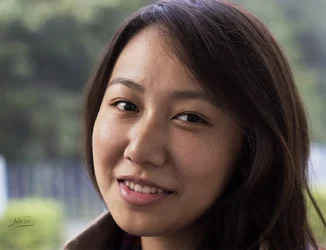
also here is what i came up with

$Untitled-2.webp

$Untitled-3.webp
 

Attachments

  • $Untitled-3.webp
    $Untitled-3.webp
    112.6 KB · Views: 82
Last edited:

Create an account or login to comment

You must be a member in order to leave a comment

Create account

Create an account on our community. It's easy!

Log in

Already have an account? Log in here.

Back
Top Bottom