First photoshoot C&C please

Foxx

TPF Noob!
Joined
Jul 28, 2011
Messages
255
Reaction score
44
Location
Atlanta, Georgia
Can others edit my Photos
Photos OK to edit
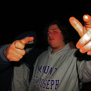
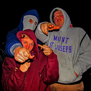
Did my first photoshoot today for a friend who missed out on getting his senior pictures done. Please hit me with everything you've got, I need improvement I know!

EDITED: Cropped right this time :lmao: Thanks for the call-out NikonME

#1
20110803-IMG_3699-2.jpg


#2
20110803-IMG_3699-4.jpg


Couldn't decide which one I liked better. How do you determine when b&w is appropriate?

#3
20110803-IMG_3708.jpg


#4
20110803-IMG_3711.jpg


#5
20110803-IMG_3739.jpg


#6
20110803-IMG_3740.jpg


#7
20110803-IMG_3746.jpg
 
Last edited:
Why are none of them in portrait orientation?
 
Do they have to be?

EDIT: Yeah they do look much better oriented like that....Well this is why I'm asking for C&C :lol: I'm a complete novice!
 
Last edited:
They don't have to be, but they call it "Portrait" and "Landscape" orientation for a reason.
 
They could use fill light in the eyes. His eyes are a little dark and lack some "pop." I also agree that they should be in portrait orientation.
 
The hands cut off in the last two kind of bother me...my two cents.

#4 is the best of the bunch IMO, but it would work better in portrait although I don't mind the square crop
 
You posted way to many photos for specifics, but I see to wide a range of white balance.
 
The white balance is causing the skintone to vary from yellow to orange.
 
I prefer the color one to the B&W. I see the same things as the others with the skin tone. I am getting good at seeing what can be better in a picture - but I don't know how to fix it or keep it from happening in the first place.
 
Ok here are my thoughts:

#1 & #2: The guy looks like he's about to fall out of the picture. There is too much space behind his head and not enough space in front of it. Also the angle you shot from accentuates his slouched shoulders, which isn't flattering. IMO, this shot would do best as a head shot... cropped tight.

#3 & #4: You captured great expression in these shots. The background is distracting to me in these first 4 photos. The two big hunks of wood really don't do it for me. Where were you and how many of those beams were there? I ask because I think you could have taken a more extreme angle with a bunch of beams getting smaller into the background. It's hard to explain lol, but if you get what I'm saying maybe you could go back and try another angle.

#5 & #6: I like the background. #5 is better than #6... never cut off hands at the wrists or feet at the ankles.

#7: I love his half-smile, and I like how he is posed. If you just didn't cut off those few fingers it would be great!

For a first shoot I think you did great. Keep on shooting =)
 
Thanks for all the advice guys!

The difference in color probably came from the ambient light difference between the two locations. The first four are on a bridge(BekahAura, where the beams come from) and the wood was very warm/orange which explains the differences in color on his skin. #5 and #6 were on the shadowed side of a building. I didn't even notice the difference in color until I got home from the shoot.

BekahAura, we plan on going back to the same location next week to get some more shots so I'll definitely keep the perspective difference in mind, I understand exactly what you're saying! And as far as framing/cropping and not missing the hands and fingers I will make a mental note of that next time :)
 
Foxx,

White balance can be edited in most photo editing software.
 

Most reactions

New Topics

Back
Top