The watermark was going to be my first thing I mentioned here. The eye is IMMEDIATELY drawn to the watermark. It is completely distracting. I have always struggled with watermarks in my own pics. I've gotten to the point that to hinder people printing my stuff and selling them (like that will ever happen but I digress), I just put the pictures on flickr at small sizes were you can't really get a good print off of it.
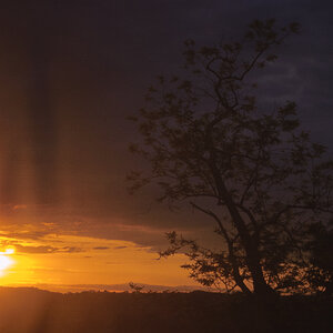
The first picture has kind of a weird composition to me. I find myself mentally moving the picture to center the flower into the middle. I think my brain wants to do that because the dead space on the top of the picture. Now, of course a center composition would be just as terrible if not worse, so I would suggest cropping it so that the flowers take up more of the overall picture and at the same time it gets rid of the dead space at the top. Basically just zooming in closer to the flowers.
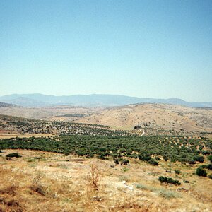
The second one, I think is the best out of the bunch by quite of bit. The dead space on the right side isn't distracting for some reason for me. I think it's because the flowers are prominent enough to give your eye something to look at. I think the dead space in the first picture is about half the picture giving you a balanced picture of half flower and half dead space. In this one, you have just over half of the picture as flower and 1/3 of it dead space causing you to have a unbalanced ratio. I think that works better for the eye because it gives it direction to know where to look. Really good job IMHO.
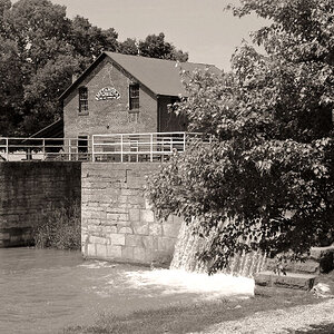
The third picture, IMHO, is the weakest of the three. Probably for me, because I see so many picture of ducks that it's become synonymous with beginner-ish picture. On top of that, the only real part of the duck that the viewer is seeing is half of the head (the beak is covered up) and back. A good rule of thumb when needing to omit body parts (and I think this rule translates nicely into the animal kingdom as well) is to cut off that item between a joint. For example, if you were shooting a married couple and you couldn't get both bodies completely into the frame then you cut off their legs in between the knee and the buttocks. In this case, the duck's face is cut in half and it just feels awkward. This, of course, IS understandable because the duck is in a covered area, but that lends itself to a weak picture IMHO.

 14May23003 by johngoodin, on Flickr
 14May23002 by johngoodin, on Flickr
 14May23001 by johngoodin, on Flickr