mdith4him
TPF Noob!
- Joined
- Jan 31, 2010
- Messages
- 37
- Reaction score
- 0
- Location
- Northern Virginia
- Can others edit my Photos
- Photos OK to edit
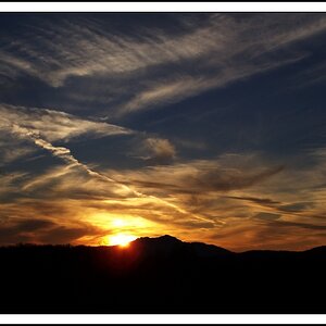
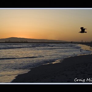
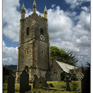
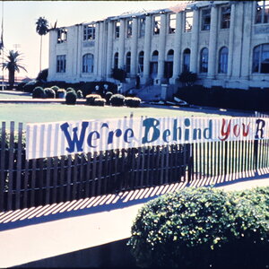
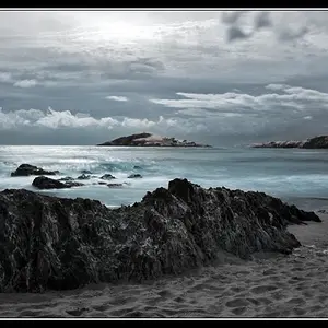
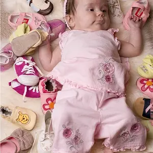
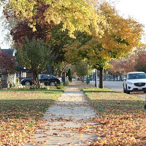
Hello  I'd love to receive some C&C on the below photos. I'm trying to work right now on getting the exposure right and learning how ISO, aperture, and shutter speed all work together. I know these aren't the most interesting subjects you've ever seen and there are probably composition problems, but I'm trying to get good in one area at a time! Otherwise, I'll probably just overwhelm myself and get frustrated, haha! So any advice you have for my exposure would be most appreciated. Anyway, here they are:


Thanks for looking
I'd love to receive some C&C on the below photos. I'm trying to work right now on getting the exposure right and learning how ISO, aperture, and shutter speed all work together. I know these aren't the most interesting subjects you've ever seen and there are probably composition problems, but I'm trying to get good in one area at a time! Otherwise, I'll probably just overwhelm myself and get frustrated, haha! So any advice you have for my exposure would be most appreciated. Anyway, here they are:
Thanks for looking




![[No title]](/data/xfmg/thumbnail/42/42466-109a1021e2f0f132abfd74e1a6e39444.jpg?1734176999)