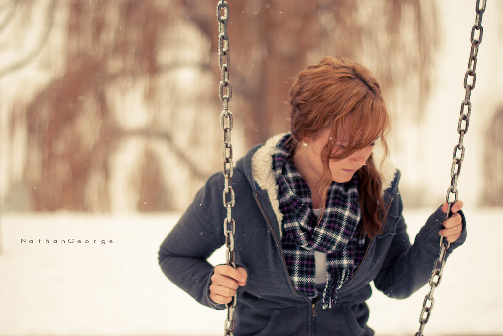
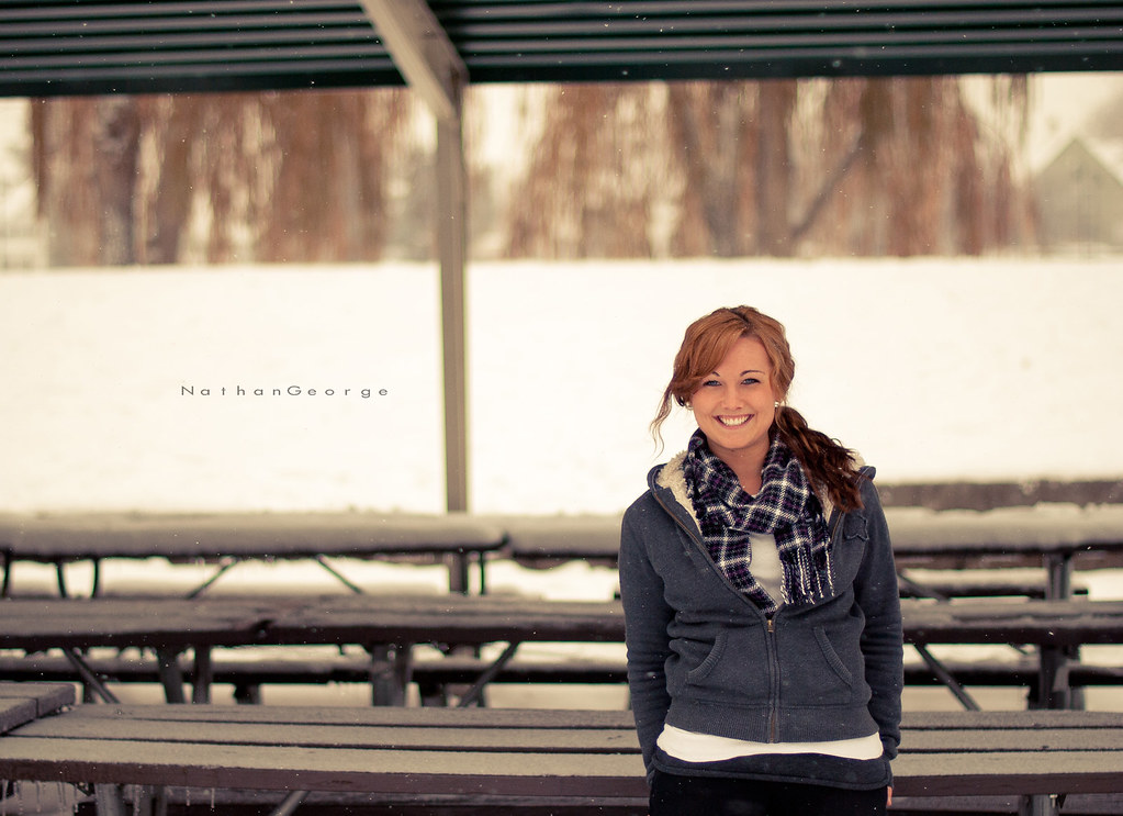
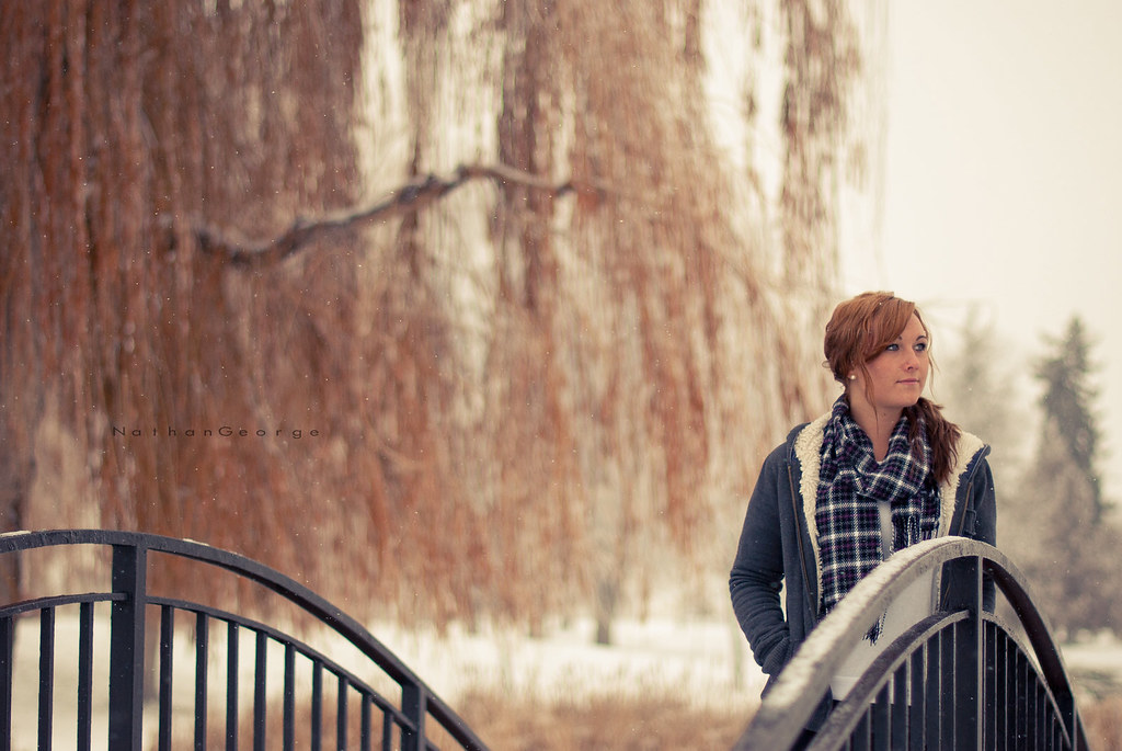
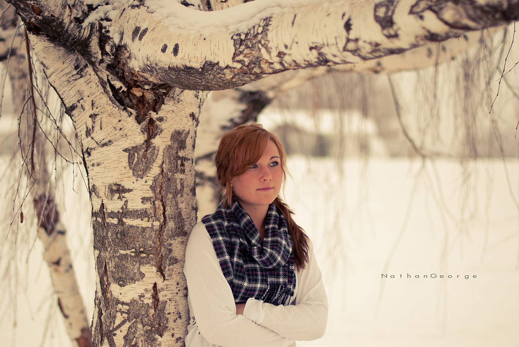
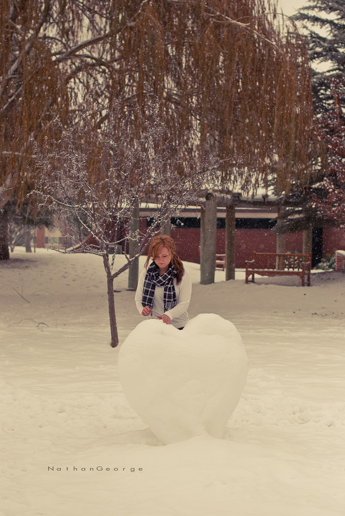
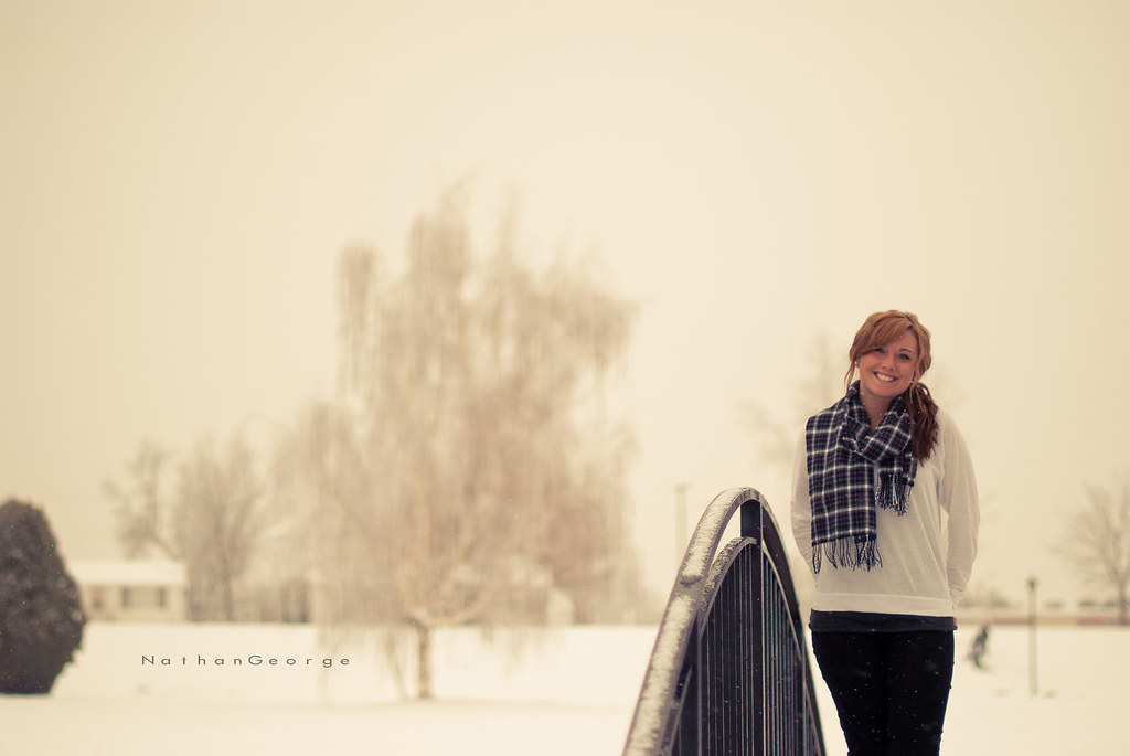
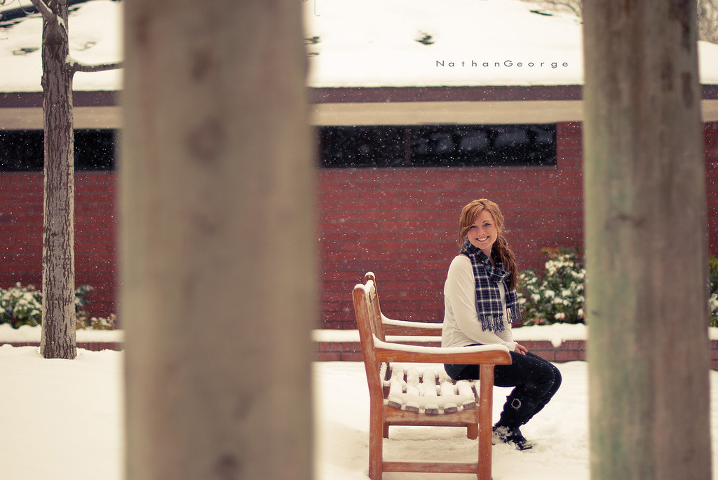
1 and 4 are the strongest to me. 1 is my favorite. Number 3 I think would be really good if you cropped some of the head space down and made it a wider crop. With a wider crop on that one the railing would work a lot better as a leading line to the girl.
Edit: I don't know if you mind your pictures being edited, but if you do just let me know and I'll remove it. But something like this. I adjusted the contrast just to check it out, but it doesn't really need it. The crop is what's important.
They are looking a little yellow to me. In some of them (like the first one) it looks OK, matches her hair, but in others (#5) I would like to see the snow be white.
I think you did a good job for your first session! I would have liked to see more shots of her eyes looking into the camera. I like the colors and the tree. Could have gotten/shared a few more close-up shots without as much going on around her. Good job.
You killed this shoot man, I like EVERY shot. Consider me impressed
One tid-bit though, you have a lot of dead space in some of the shots on either end of the frame. While a little dead space sometimes works, too much space is a negative imo.
Mind sharing your processing 'process' (lol) on them?
I love your compositions and locations. I don't mind the middle toning, but the yellow is not to my taste. I post the edit for consideration. I understand it is more about personal taste and not so much about technical quibbles.