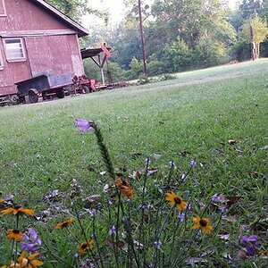
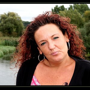
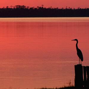
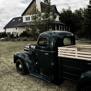
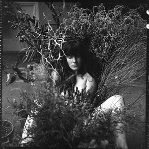
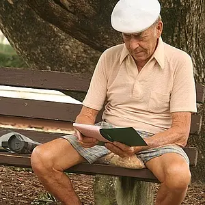
IMO, the problems with 1-4, are that there is absolutely no personality showing in the subjects and there are numerous technical failings.
In #5, there are some technical issues that should be fixed - because they either interfere with the impact of the image or because they distract from the impact by niggling at the viewer's consciousness.
There's lots of useless empty space above the subject's head for no artistic reason.
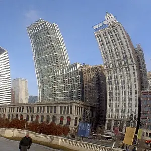
There is a lot of perspective distortion, light poles and trees leaning in.
House is large and bright.
(I wouldn't have cropped quite so closely; forced to by removing the distortion.)
What is good is there is lots of personality in the stance of the subject and everything else in the picture, backgrounds, night, skateboard, add to the viewer's knowledge about the subject. It is bit low contrast in the subject, but it's liveable.
The image is coherent; all parts work together.



![[No title]](/data/xfmg/thumbnail/37/37626-4a6ffc3f17ab3a8e97170fda3276640e.jpg?1734170750)
![[No title]](/data/xfmg/thumbnail/30/30887-70db98f68651b2f6c62119e611f707c0.jpg?1734158896)
![[No title]](/data/xfmg/thumbnail/30/30889-6a35eb14fac2d7d837d49a6a1757d874.jpg?1734158902)