They aren't bad, but there's some problems:
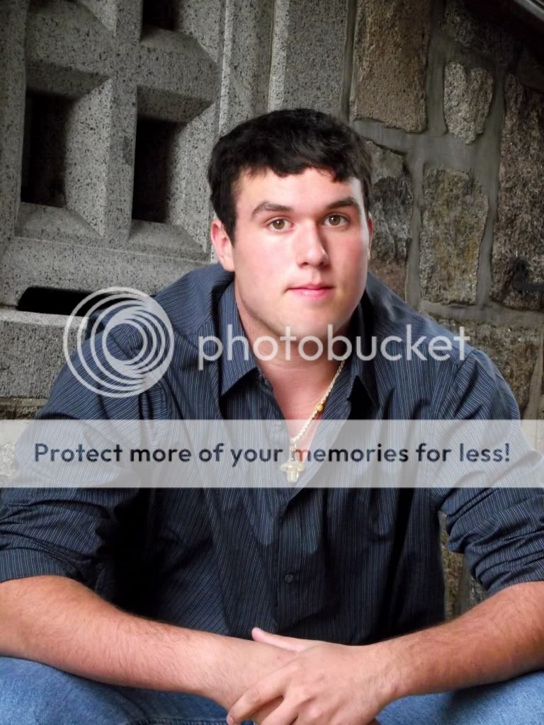
#1: If you're going to do a pose like this, I don't recommend chopping off the elbows; at least not right at the corner where you did. If you need to crop them off for some reason, crop it in farther so it looks like it was done on purpose.
#2: I would have moved him about 2 steps to your right so whatever that darkness in the background is would not be overlapped by his also-dark shirt. They run together and become this heavy mass on the left of the photo. There's nothing on the other side to balance it. You may also want to consider a vertical crop for this photo, since it's a portrait and the background doesn't serve to further the picture in some way.
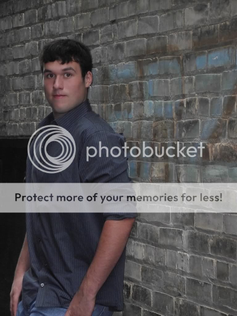
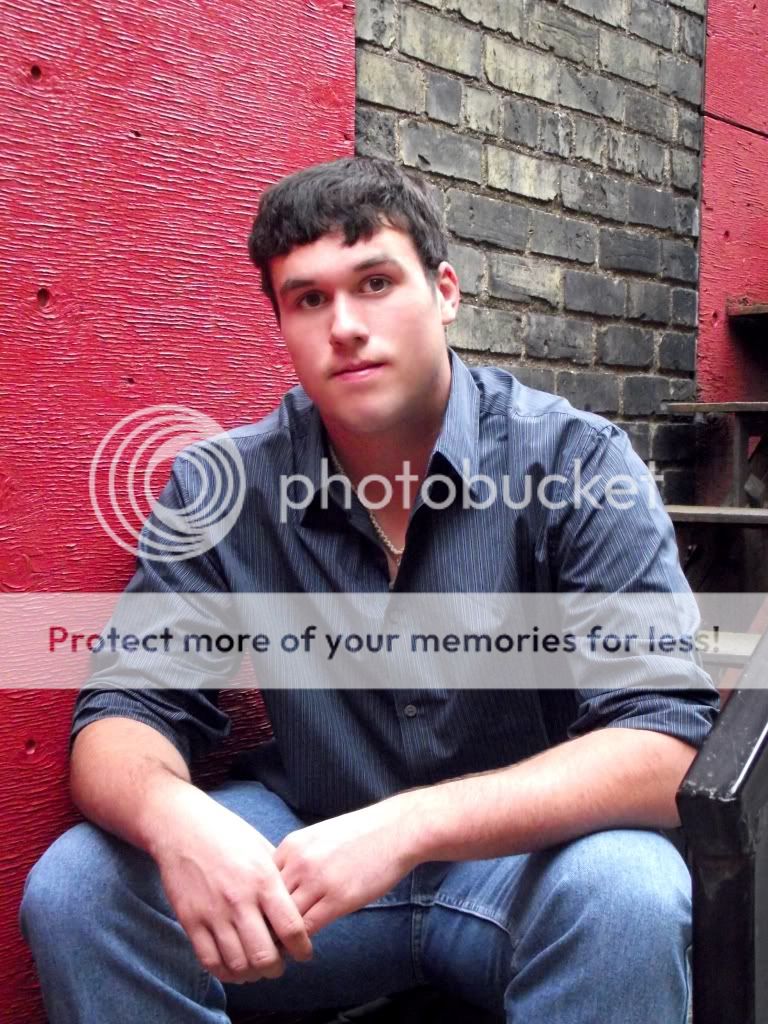
#'s 3 & 4 both have really distracting backgrounds. Consider moving the subject away from the background so it becomes blurred and is less distracting.
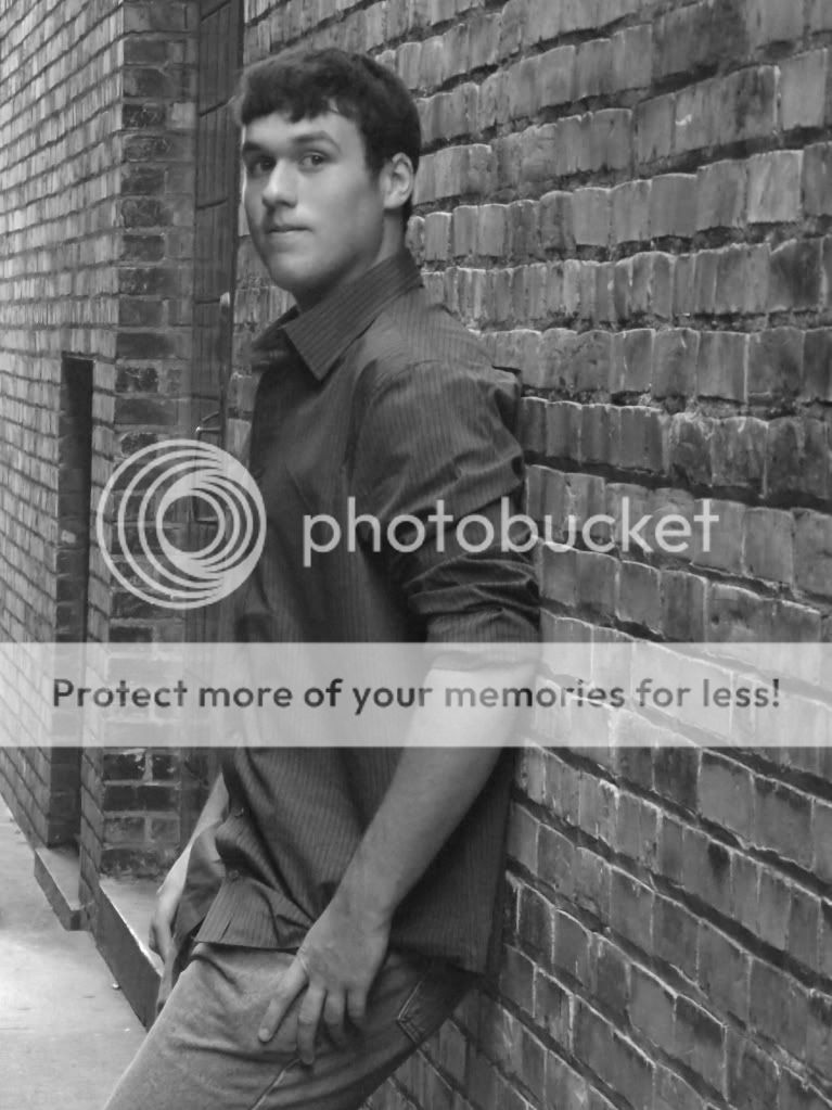
#5: Again, his dark hair & shirt are merging with a dark area (the door).
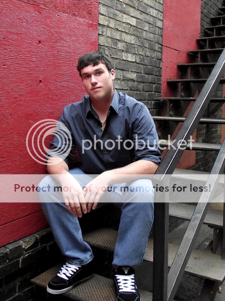
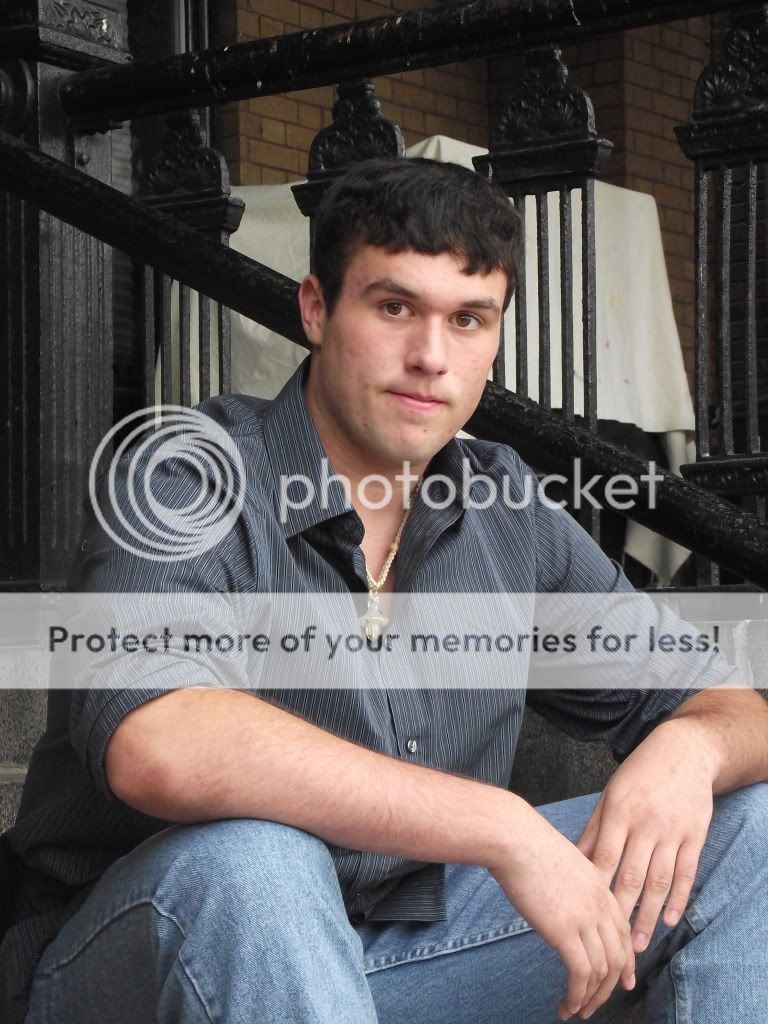
#6 is my favorite of the lot. Some won't like the background because it's a little noisy, but I like the lines. I think it could have been better if whatever is under that sheet weren't there, but you may have no control over that. Watch the elbows!
Good shots, but keep in mind that your sole subject should be the client. It the background doesn't make the client more interesting, look better, or say something personal about the client, then do a portrait orientation (vertical) shot.
Keep it up!


")


![[No title]](/data/xfmg/thumbnail/31/31979-ea92aca54ae865842d998c9cec534991.jpg?1734160756)
![[No title]](/data/xfmg/thumbnail/38/38292-ab7b4579becf6f3bda3ef5b18219d707.jpg?1734172201)


