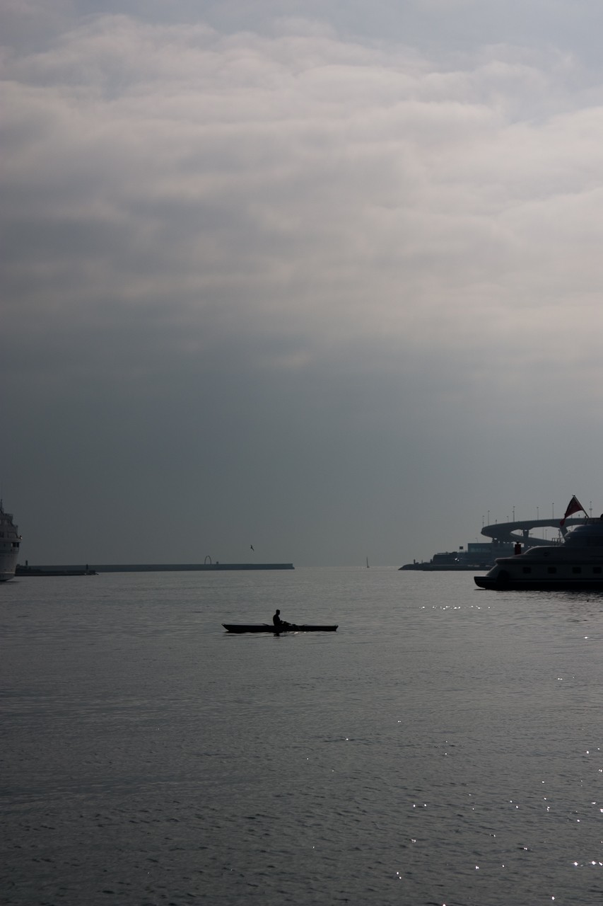
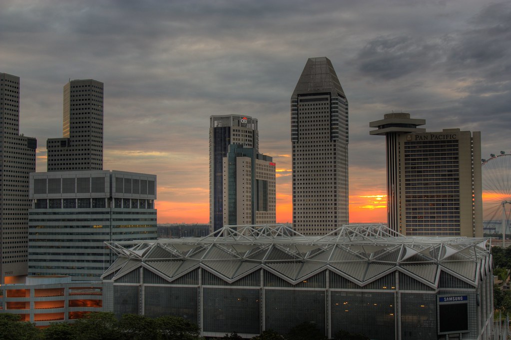
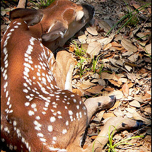
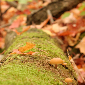
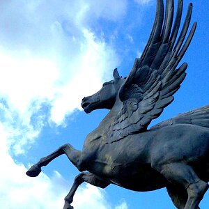
I really like the 2nd pic. The colors and clarity of the photo make it stand out. I like the 3rd as well. Personally, the 1st pic had too much empty space and the subject looked like specks.
Here's my attempt at editing your 1st pic... a tighter crop would help bring everything into focus rather than looking like specks.
I think #2 is awesome! How did you do that? I'm just learning and seeing what gear was used and aperture, speed, ISO, tripod, etc. helps a ton. Beautiful shot.

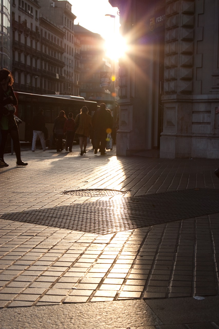
 Love the colours coming throught the buildings

![[No title]](/data/xfmg/thumbnail/30/30875-d76f1fa085aee4334cb6b0cd62bb5e2d.jpg?1619734491)
![[No title]](/data/xfmg/thumbnail/34/34140-74799834a513b0cbf28dfda9aeae291b.jpg?1619736312)

![[No title]](/data/xfmg/thumbnail/39/39289-c5ea6a611707fdd5786347f4a67d63ae.jpg?1619738957)
