What's new

first still life c&c

barleymalt

TPF Noob!
Joined
Jul 2, 2010
Messages
142
Reaction score
2
Can others edit my Photos
Photos OK to edit
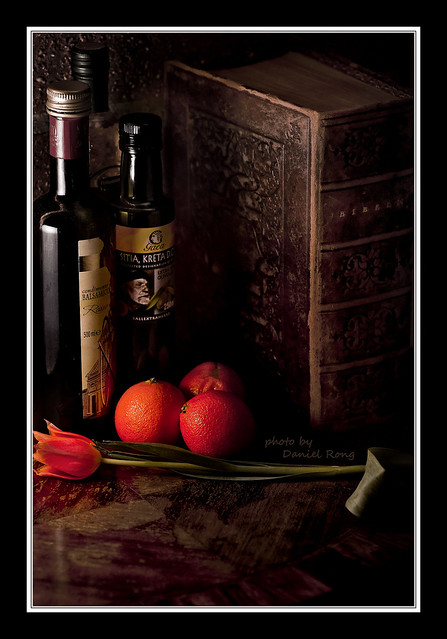
Just bought my first flash today. This is my first attempt at working with lights. Don't be nice.

5530901830_c56755c386_b.jpg


2nd try:

5533513202_e942ae9673_z.jpg
 
Last edited:
Don't be nice.

HA.

Anyway... 10/10 for effort. I expected to open this thread and see a photo that had nothing to do with 'still life' and with poor lighting (and I didn't recognize your profile name so it has nothing to do with you). This photo was a big surprise to me.

The good: The lighting is interesting. The items you placed there are interesting.

The bad: The image is tilted. You need to rotate it like 5 degrees counterclockwise so the vertical lines are straight up and down.

The ugly: You cut off both the left and right sides.

I really want to like this image.. and I do anyway a little - but the cutting off of the bottles and book are unforgivable. Slap yourself on the wrist and try again.

I've had a few drinks so don't take me too seriously.

:)
 
I appreciate the input! You're right about the tilt, I was hoping noone would notice haha. And I agree with you on the awkward crop.
 
subject arrangement is good! light a bit harsh on the bottle far left.
 
I like it. Its an interesting subject
 
Thanks, and thanks! Looking at it again I really should of put up something to reflect a little light back on the top of the book to show some detail on the pages and light the wall a little. Guess I'll give it another shot tonight.
 
Okay so i think you have a nice composition going, has an interesting older look to it, i think you could desaturate the oranges just a tad to further the old look.

I don' think the cutting off the book and bottle is bad but you need to rotate the photo counter clock wise like mentioned before. Also i notice your shadows are a little bit too harsh and i would have defused the light a bit to get the softer shadow and then sharpened for the grunge feel.
 
I really do like the arrangment. I agree with the bottel and book being cut off is unforgivable and really IMO yes the lighting is kinda really harsh.. Thanks for sharing and post it again!
 
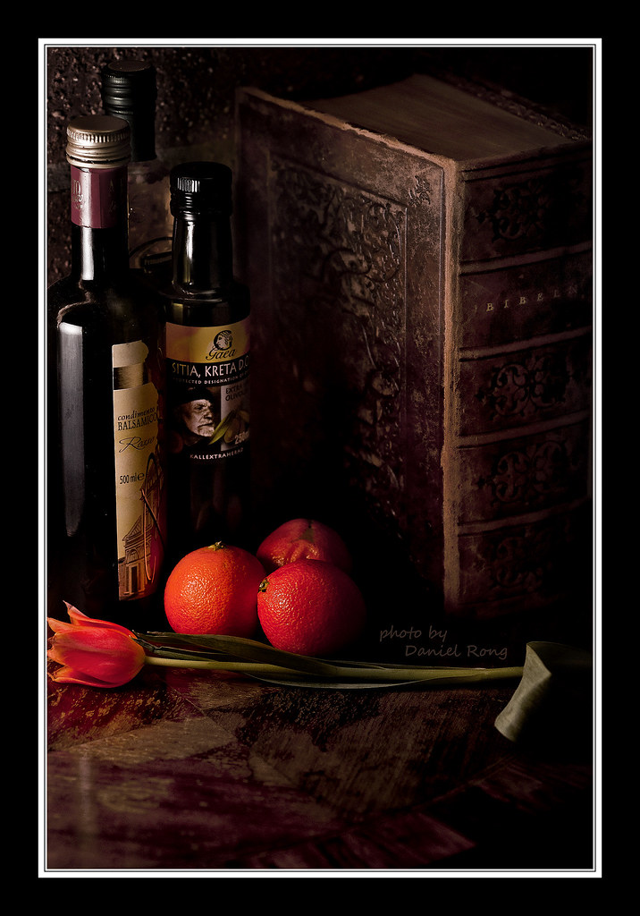
Had another go at it..a little better light but far but I stilled messed up the framing :/

Shot using a piece of white paper as a diffuser this time, and a little bit of ceiling bounce.
5533513202_e942ae9673_b.jpg
 
Try desaturated the colors like you did in the first one, i think it might look better.
 
Try desaturated the colors like you did in the first one, i think it might look better.

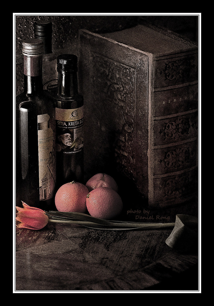
Here it is with a bit of grunge.
5533647506_d165aee125_b.jpg
 
Last edited:
Its a lot better! Lighting is not as harsh as befor and you didnt cut off as much of the items in the shot.. lol. : )
 

Create an account or login to comment

You must be a member in order to leave a comment

Create account

Create an account on our community. It's easy!

Log in

Already have an account? Log in here.

New Topics

Back
Top Bottom