I think it's a few too many for detailed individual critique. I also think it's not bad at all for your first go! Some quick thoughts:
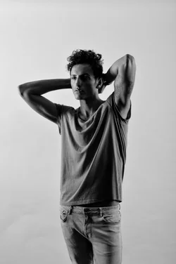
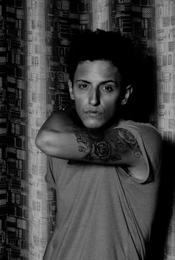
1. There's a reason we call it the 'background'; it should be far back. In this case strong linear elements are taking the eye away from the subject. Your key light is a bit low; it looks like it's right about upper-chest. Bring it up a couple of more feet.
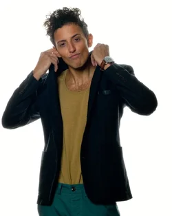
2. Not bad; I find the shadow on the near side just a little too deep for my taste; perhaps a reflector for fill?
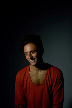
3. Raise the key up 2' and drop it down 1/2 stop; you're close here.
4. A bit flat and slightly underexposed. Your background light is WAY too hot!
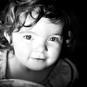
5. Better height on the key this time, but the specular highlight on his forhead is a bit intense; either bring the light closer, or add more diffusion material.
6. Good, but under-exposed.
Overall, not bad. Remember that generally speaking we are used to seeing people lit from above (sun, overhead lighting) and for the most part, you want your key light above the subject (There are LOTS of times when that's not the case, but for now, get the basics down; walk before you try to run), and that your fill should be at least 2/3 of a stop below key. Remember too that the closer the light, the larger the light source will appear and the softer it will be (softer shadows, better wrap) and the farther away, the harsher it will be.
Just my $00.02 worth - your mileage may vary.
~John






![[No title]](/data/xfmg/thumbnail/37/37604-7ad625e983f92f880eb65a264eeef5e4.jpg?1734170732)

![[No title]](/data/xfmg/thumbnail/36/36423-4f4abd5f32da2219d4967c7a13b07a8c.jpg?1734168833)



![[No title]](/data/xfmg/thumbnail/40/40306-ea393f71adcd88a9abb9fb16dc6af2d5.jpg?1734174714)