First time not on auto CC

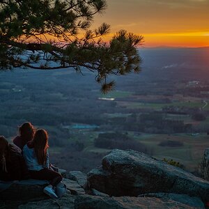
Maybe try and find a better place to take the pictures. I dont really like the view.
Smile.gif

My area is on the top 10 most beautiful places in the USA, so it's not the view it's you. :D
 
Last edited:
good job on going off auto... it too me much longer to do that than it did you! :lol:

i can tell that you've got an eye for the type of shot you are trying to capture. you are off to a great start! i would like to make a few suggestions for improvement as far as composition goes.

#1 seems out of focus. this would be a perfect shot if the stalks of grass were moved over onto the first third of the left hand side (rule of thirds) and if the stalks of grass were in focus. this has a nice peaceful feel to it.

#2 is a nice sunset capture. i like that you've used a lake to capture a reflection. the sky is so beautiful! however, all of the birds or stones (can't tell) in the water and the houses off in the distance, make the composition a bit too busy in my opinion. i think you could easily fix part of this problem by increasing the blacks in this photo so that it just looks like a silhouette of trees and you lose the houses (if that makes sense). it would also be nice to adjust the saturation of those colors in the sky to make them pop just a little more.

#3 is a bit too centered here. don't forget the rule of thirds

#4 is a very nice, simple composition. and the DOF here is excellent as well. i would suggest cropping out part of the bottom and right hand side of the photo to keep the composition in line with the rule of thirds.

i think you've got some really nice photos here and you're off to a great start. some of the suggestions i've made require some photo editing software. if you don't already have photoshop or lightroom, i would suggest checking out gimp software for now because i believe it's free! You can find it here: GIMP - The GNU Image Manipulation Program


I agree with you about number 1, I'm going back in tomorrow to different places and will try to get it right. I could try to get some pics of the #2 area without the birds. Today I went out with a list of places that I had to take pics of, for my gf. So I was on a time limit, thus I couldn't sit there and fiddle with things. Tomorrow I will have all day though. I agree about number 3, I didn't know about the comp rules when I took this picture, same with #4. I have photoshop CS3 extended and Aperture 2.

Oh, and I edited #4.
DSC_03681.jpg


better?


Also I tried to increase the contrast and got this, not sure how to just increase the blacks... But to be honest I liked almost being able to see the house, mainly because I thought it added to the landscape. But I'm up for anything. :D

DSC_00722.jpg
 
Last edited:
I have photoshop CS3 extended and Aperture 2.

How are you finding photoshop CS as a beginner?

It is ok. To be truthful, if I don't need to actually take something out of the image or when shooting people, remove wrinkles, lines, blemishes, etc. I won't use it. I use aperture much more then photoshop, mainly because it is easier and seemingly more effective for what I need. If you are on the edge, just download the trial. You can get it others ways, which aren't exactly legal. But if you need help with those "ways" message me and I can help. I don't use those ways much, but know how.
 
I was thinking more like this:

balls.jpg


The twig is a nice leading line through the dead space to the subject. Personally I like the blurred white ball in the upper left, because it echoes the subject, and brings your eye back up. The repeated color/shape helps keep the viewer in the image a bit longer. In my opinion, that is.

What you did just created a lot of boring unecessary dead space to the right of the subject...nothing to see there.
 
Thanks! Now I see what you mean, always learning something here... lol :mrgreen:
 
I was thinking more like this:

balls.jpg


The twig is a nice leading line through the dead space to the subject. Personally I like the blurred white ball in the upper left, because it echoes the subject, and brings your eye back up. The repeated color/shape helps keep the viewer in the image a bit longer. In my opinion, that is.

What you did just created a lot of boring unecessary dead space to the right of the subject...nothing to see there.


yes this is exactly what i was thinking as well :) this looks much better!
 

Most reactions

Back
Top