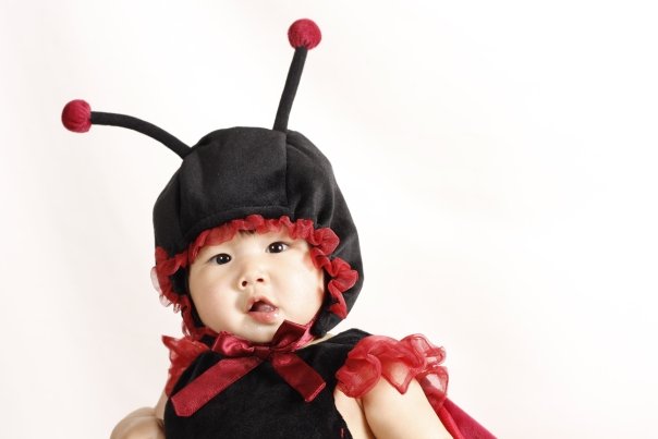
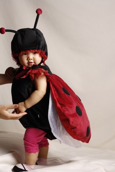
I will say that #2 and #3 are adorable pictures. Very, very cute.
Backing away your fill flash will reduce the second catchlight, leaving the key light to produce a larger (only) one.
Is the sheet white or cream? It's very hard to tell whether the white balance is off or whether that's supposed to be that color.
In any event... the balance between key and fill in #1 is quite nice. It produces nice, feature shaping and soft shadows. I'm not sure that balance carried over into the other images, especially #4 (shadows are harsher) and #5 (lighting seems flat and too well balanced).
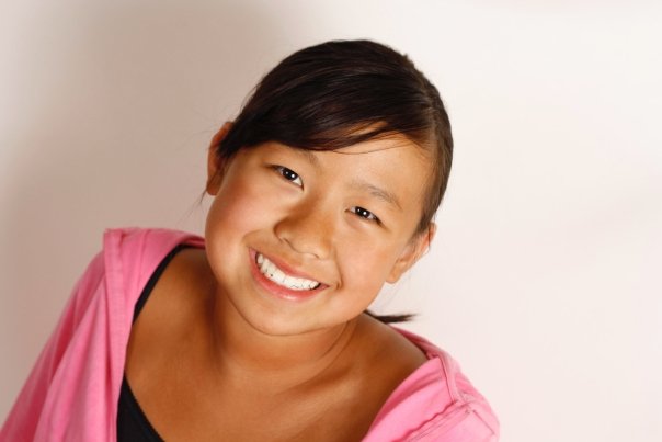
Composition could use some work. #1 uses this great angle and pose that... places her back in the middle of the frame. Not always a bad choice, but here there's this huge gap on the right side that has negative space that's not so useful. It can't go away completely, but it could be reduced.
#2 is cute but here's a place where a more centered composition may be appropriate (especially along the horizontal axis). The downside is with the antennae like they are, it's hard to get a balanced photo without including more of the torso.
I can understand why #3 is how it is. It's so darned cute despite some technical and compositional flaws (which I think may have been completely unavoidable).
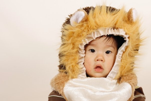
#4 and #5 suffer from the same thing -- great idea to move them off center one way or another, but I feel that you've moved them too far. The leading room is excessive, ultimately leading to an unbalanced image.
#4 is, again, adorable, but in contrast to the bug outfit, this costume seems to conceal the subject. I might have taken a few in costume with the hood part down showing the subject's neck a little bit. It may or may not have worked, but you'd get the context of the costume and be more focused on the subject.
#5 cuts off the chin. There is no absolute rule about cutting off chins, but it plays against convention. here, it looks like an accident.
On the flip side, the expression in #5 is so honest and genuine that it's a really great capture in terms of emotion. An excellent catch and choice to display for that reason.


![[No title]](/data/xfmg/thumbnail/32/32707-3c49d54a87afb53e65c60391858400be.jpg?1734162298)


![[No title]](/data/xfmg/thumbnail/38/38745-268bf5126e563d77957d73c4fb17dc83.jpg?1734172603)


