Derrel
Mr. Rain Cloud
- Joined
- Jul 23, 2009
- Messages
- 48,211
- Reaction score
- 18,936
- Location
- USA
- Can others edit my Photos
- Photos OK to edit
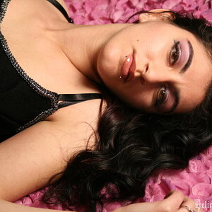
Can you imagine how insanely great these would have been is you'd shot them with a 6x6 format camera??? All the chops would have been eliminated, and you'd have a great big image to crop into to get it 'just right'. I do like the simplicity of this set...lovely woman in timeless clothing, simple hair style, minimal almost no makeup look, good teeth, that irritating green hairband on one wrist...but the chops are killing these poses. Makes me wanna smack you and yell "BACK UP, dude!" The poses she was in were okay, but the way the narrow 3:2 frame aspect ratio has been deployed makes the pictures feel uncomfortable. But man, she sure is a lovely lady. Maybe some of these can be salvaged by tighter cropping?
On #6, the flash on background. One thing I see is that the flash is angled upward somewhat, and that has the effect of raking the light across the backdrop, thus actually creating visual shadows and highlighting wrinkles. The best way to do that is to make sure the background light is aimed square-on at the backdrop material, and is not "angled" in any highly directional way. Unless you do want to create a textured or lines and shadows kind of look.
As far as the lighting goes, on #2 and #3, I think it looks simply awesome. VERY classic,simple, appealing lighting. EXCELLENT lighting ratio! It looks just...awesome on her, with those clothes and that skin coloration and those expressions/poses. The way the light sweeps across the entire broad width of her face in #5 and #6 causes her face 'mask' to be lighted up entirely, and widens her face quite a bit, and is not as flattering a way to apply the light as it is in #2 and #3, which serve to slim-down her face, and adds drama with the shadowed side being visible. In 5 and 6, there isn't much in shadow.
If you are using speedlights without modeling lamps, it's difficult to actually SEE what the light placement/model positioning combination actually looks like until an image has been shot and is under review. That makes learning/practicing very much a trial-and-error process.
On #6, the flash on background. One thing I see is that the flash is angled upward somewhat, and that has the effect of raking the light across the backdrop, thus actually creating visual shadows and highlighting wrinkles. The best way to do that is to make sure the background light is aimed square-on at the backdrop material, and is not "angled" in any highly directional way. Unless you do want to create a textured or lines and shadows kind of look.
As far as the lighting goes, on #2 and #3, I think it looks simply awesome. VERY classic,simple, appealing lighting. EXCELLENT lighting ratio! It looks just...awesome on her, with those clothes and that skin coloration and those expressions/poses. The way the light sweeps across the entire broad width of her face in #5 and #6 causes her face 'mask' to be lighted up entirely, and widens her face quite a bit, and is not as flattering a way to apply the light as it is in #2 and #3, which serve to slim-down her face, and adds drama with the shadowed side being visible. In 5 and 6, there isn't much in shadow.
If you are using speedlights without modeling lamps, it's difficult to actually SEE what the light placement/model positioning combination actually looks like until an image has been shot and is under review. That makes learning/practicing very much a trial-and-error process.




![[No title]](/data/xfmg/thumbnail/32/32929-22e23acc63d6ecb25e5ee941be87121f.jpg?1734162700)