What's new

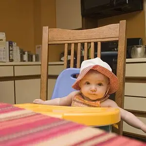
Flashed my son. C&C please.

Pretty good. Suggestions:

A little underexposed, I'd brighten it 0.5 stops in post.

It's a bit on the orange/yellow side, adjust white balance slightly

It's too heavy on the center/left side, crop of a bit of the right side to balance the composition--perhaps adding a little more black-space to the left, as his looking left leads your eyes off the image.

See if you can brighten the reflections in his eyes a bit in post.
any better?

updated by kyle.emley, on Flickr
 
I kind of prefer the original, dark, moody rendering, which appears subtle and accurate. I do not think that the re-work is an improvement.
 
I kind of prefer the original, dark, moody rendering, which appears subtle and accurate. I do not think that the re-work is an improvement.
I would DEFINITELY second that motion:thumbup:
 
After the PP work his face starts to look bruised, which cannot be the desired effect, hence also I prefer the slight "orange" tint of the original. Better than "bruises" on such a cute, little face!
 
Here is something in the middle.
5272785576_a7466eb182_b.jpg


Just some curves and levels adjustments
 
Something is really wrong with the first post. The tip of his nose has black shade. I think the left side of his face should be nice, shiney and crispy... This one is a little odd. Did you use burn tool by any chance?
 
I like the original and agree with cropping some off the right side.
 
I kind of prefer the original, dark, moody rendering, which appears subtle and accurate. I do not think that the re-work is an improvement.

+1... I think the lighting sets a mood the way it is. I like it.
 
Something is really wrong with the first post. The tip of his nose has black shade. I think the left side of his face should be nice, shiney and crispy... This one is a little odd. Did you use burn tool by any chance?
i think i got most of that black shade removed. i brightened the flash reflection in his eyes a bit more and tried a middle of the road skin tone.
heres the last edit.

last edit by kyle.emley, on Flickr
 
I prefer the first version, I also am onboard with a small crop pulling in the space behind him.
Warmer tones are often times more welcoming to the viewing eye then the colder tones. So with this shot of a child, the warm tone works perfectly in making the shot more visually pleasing to the human eye.
 
Pretty good. Suggestions:

A little underexposed, I'd brighten it 0.5 stops in post.

It's a bit on the orange/yellow side, adjust white balance slightly

It's too heavy on the center/left side, crop of a bit of the right side to balance the composition--perhaps adding a little more black-space to the left, as his looking left leads your eyes off the image.

See if you can brighten the reflections in his eyes a bit in post.
any better?

updated by kyle.emley, on Flickr

I like the crop, and the eyes being brighter, but I have to agree with the others about the brightness and color--the exposure and white balance in the 2nd version is more "technically correct," but I also prefer the mood of the original.
 

Create an account or login to comment

You must be a member in order to leave a comment

Create account

Create an account on our community. It's easy!

Log in

Already have an account? Log in here.

Back
Top Bottom