

PixelRabbit
A naughty little bunny...
- Joined
- Nov 28, 2011
- Messages
- 6,593
- Reaction score
- 3,719
- Location
- Ontario
- Can others edit my Photos
- Photos NOT OK to edit
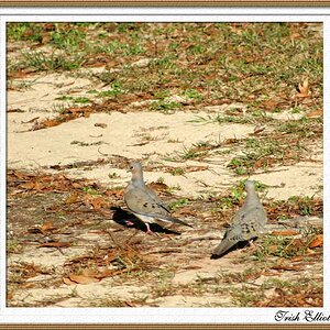
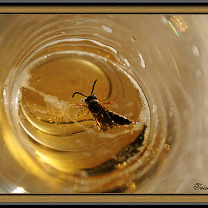
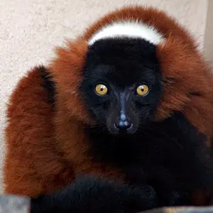
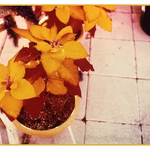
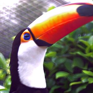
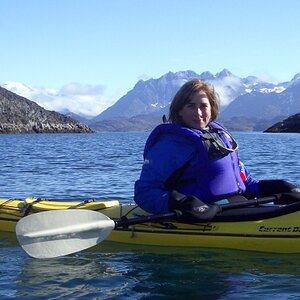
Today was a busy day behind the lens from early morning to sunset, it was glorious 
Would love to hear your thoughts on these
Flow



Would love to hear your thoughts on these
Flow


![[No title]](/data/xfmg/thumbnail/38/38261-db20f6f92ee8f0d4c5cf1536e308638b.jpg?1734172147)
![[No title]](/data/xfmg/thumbnail/32/32711-b57dd72845f94aa34b3bd7207b07f98c.jpg?1734162320)
![[No title]](/data/xfmg/thumbnail/32/32710-b10dfc8ee698235cdc1e7572139173e8.jpg?1734162313)

![[No title]](/data/xfmg/thumbnail/32/32708-c55da623febe9d91efe5f28aa54c3090.jpg?1734162300)
![[No title]](/data/xfmg/thumbnail/38/38264-552eb428d8a704186dcc43400f417d0f.jpg?1734172154)