Fog in the harbour - 3 versions

pgriz

Been spending a lot of time on here!
Joined
Jul 30, 2010
Messages
6,734
Reaction score
3,221
Location
Canada
Can others edit my Photos
Photos OK to edit
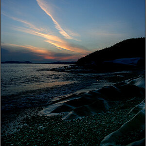
This morning I drove my wife to work at the mansion by the lake and the air was cool and moist, with an autumny tinge to the stillness. The fog intensified as we got closer to the water. Coming back home, I took the road by the lakeshore and passed a small sailing harbour. Opportunity.

So here are three version of that foggy scene. Which one (if any) do you find interesting, and why? And if you find them boring, hey, that's an opinion that's valid too.

1. Foggy 1
Foggy_1_3280.JPG


2. Foggy 2
Foggy_2_3282.JPG


3. Foggy 3
Foggy_3_3283.JPG


Any opinions? Comments? Suggestions for improvement?
 
I think I'd like #3 best if it were processed to level/straighten the horizon and remove about 2/3 of the foreground water.
 
I really like them all. Mostly because they leave me with a hollow feeling of dread in my stomach when seeing them. They have great "emotion" in them.

The only thing I would try is to add a touch of clarity to the first one with a slight (very slight) dark vignette around the outside edges. Just to get a little more into the Stephen King touch. ANd maybe, just maybe, bring the main focul point closer to the center, there's a little too much dead space (no pun intended) on photo left.
 
I agree with Tirediron. number 3 is the best for me. Nicely done!
 
So John, I've tried your suggestion below:
Foggy 3 version 2_3283.JPG


You were right about the levelling (0.6 degrees), but I'm not getting the same feeling about the scene with the water gone. Not saying it's wrong, just that it doesn't give me the sense of isolation that the original conveyed. But I'm going to stare at both versions some more to see which ones seem to work better.
 
So John, I've tried your suggestion below:
View attachment 85178

You were right about the levelling (0.6 degrees), but I'm not getting the same feeling about the scene with the water gone. Not saying it's wrong, just that it doesn't give me the sense of isolation that the original conveyed. But I'm going to stare at both versions some more to see which ones seem to work better.
This image needs the darker water in front to give it that ghostly, other worldly feel
 
Try cropping away some of the sky? I think it needs the horizon moved significantly up or down from centre. Personally, I find the even-ness of the grays much rather nice, but I understand the point about the dark water as well.
 
I really like them all. Mostly because they leave me with a hollow feeling of dread in my stomach when seeing them. They have great "emotion" in them.

The only thing I would try is to add a touch of clarity to the first one with a slight (very slight) dark vignette around the outside edges. Just to get a little more into the Stephen King touch. ANd maybe, just maybe, bring the main focul point closer to the center, there's a little too much dead space (no pun intended) on photo left.

"hollow dread" eh? That's more drama than I usually evoke. Except for when I cook. Then sometimes that feeling is fully justified. :icon_lol:

I'm going to try your suggestion. But later, as it's time to do some "useful" work. TPF can be such a seductive time-waster!
Remind me to never eat by you lol.
And yes, it is.
 
I'm going to be the different one here and say #1 is my favorite.
 
3 for me - straightened of course but with the exact same framing - this seems to be one of those exceptions where a central horizon just works.
 
I think #1 is hurt quite a bit by the boat at the far right being on the edge of the frame. I would crop out that boat, and then make a wide-aspect frame with some of the sky cropped away.

AS-SHOWN, I like #3 the most, and to me the dark water at the bottom is crucial, since it shows the fog increasing in the distance. Eliminating the dark water hurts the shot.
 

Most reactions

New Topics

Back
Top