Foggy Morning for C&C

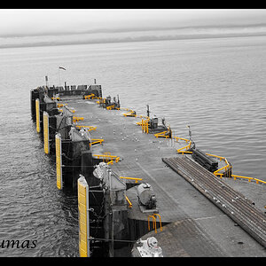
TK's edit was a bit too desaturated for the foggy scene and became flat.

Your final edit looks like a hybrid of my edit and TK's, and I think it's just right. Now print it and hang it. ;)

Thank you! I looked back at yours and TK's and I think it is a hybrid and I didn't even mean to do that.
 
$web.jpg

Looks good but I find the image warm for a foggy image.
 
bianni said:
<img src="http://www.thephotoforum.com/forum/attachment.php?attachmentid=24621"/>

Looks good but I find the image warm for a foggy image.

Yeah it is a little warmer because the sun was off to the right and was shot early in the morning. I played with the wb and I liked the warmth better. I felt cooling it down took some of the life from the image. Do you think I should go to the cooler wb if that is how it was?
 
I love the idea, but in my inexperienced POV, there are a few changes I would have made.
I feel (note - feel. Not - know) it needs to be desaturated, slightly underexposed and drop the clarity slider a bit to give it a little more of a softer, foggy, ethereal look.
I would also crop it as more of a panorama, you don't need as much of the empty sky or grass.
My last recommendation would have been to leave more space on the right side of the dock. it feels like it's too cramped.
Just remember, these are just my opinions.

EDIT: My wife prefers the original lol.

This edit nails it, IMO. Nicely done.
 
I second FanBoy's motion!

Thank you.

I love the idea, but in my inexperienced POV, there are a few changes I would have made.
I feel (note - feel. Not - know) it needs to be desaturated, slightly underexposed and drop the clarity slider a bit to give it a little more of a softer, foggy, ethereal look.
I would also crop it as more of a panorama, you don't need as much of the empty sky or grass.
My last recommendation would have been to leave more space on the right side of the dock. it feels like it's too cramped.
Just remember, these are just my opinions.

EDIT: My wife prefers the original lol.

This edit nails it, IMO. Nicely done.

What do you like about his edit compared to my updated edit?
 
It got rid of some of the dead sky and brought the focus more tightly in on the subject. The color treatment gave it a warm, rustic feel.
 

Most reactions

New Topics

Back
Top