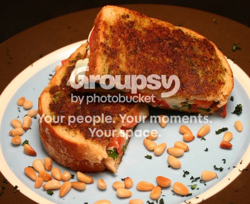
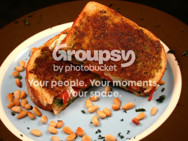
Of these I like the top one the best - the surface of the bread looks the most appealing. I'd be inclined to show more of the filling - it is too much in the shade or just hidden. I'm OK with the pine nuts, and the other garnish, but the plate itself is a bit of an optical illusion - the bright band looks like the edge of the plate at first glance, and the outer brown part of the plate looks like the table, then the garnish looks messy. Either swap the plate or re-light it, or don't put any garnish on the brown rim.
On second thoughts I think that I would reduce the number of pine nuts and bits of garnish, but that is something I would mess around with. I'd also be inclined to make sure that the bread surface was lit in a more lively way - slightly raking, and from the back to prevent any feeling of dullness. The top picture is nearly there in that respect, but once the bread is realigned to show the filling the light would have to move.
I hope that is of some use to you.
Best,
Helen




![[No title]](/data/xfmg/thumbnail/32/32930-09414fc020c2a60a456ff59a05c5ef8f.jpg?1734162706)

![[No title]](/data/xfmg/thumbnail/30/30988-aef3845b94a67d6dcce6e4e59d5d66c3.jpg?1734159046)

![[No title]](/data/xfmg/thumbnail/37/37119-95714aab9befe33ecb7b951366bedc94.jpg?1734169832)