Forest Haven

Murray Bloom

No longer a newbie, moving up!
Joined
Jun 6, 2007
Messages
440
Reaction score
85
Location
Baltimore, MD
Website
www.murraybloomphoto.com
Can others edit my Photos
Photos NOT OK to edit
Here are a few from an abandoned mental hospital. Most were five shots in very dark spaces. C&C?

Morgue:

$Morgue.jpg

Morgue Door:

$Morgue-Door-c.jpg

Hallway:

$Hospital-Hallway-c.jpg

Stairway to Heaven:

$Stairway-to-Heaven-d.jpg
 
Last edited:
Great shots perfect example of what hdr is imo
 
OMG there is a ghost in #3!!!!:confused:

On a more serious note. :thumbup:
 
Thank you for your comments. I'm glad that you like the pictures. They are a bit misleading because the place was really dark, about EV 9. I literally couldn't see what I was stepping on, or my hand in front of my face. Exposures on the first three images were up to 13 seconds, centered on 3 seconds at f11, ISO 200.

For anyone who's interested, the fourth image is a story in itself. It was never intended to be a 'real' image at all, nor HDR. My shooting buddy, Kathleen, was walking up the stairs and stopped in front of the window when I asked her something. I thought it looked cool enough to make a portrait for her, so I banged out a bracketed set, all of which I badly underexposed because of that bright window. Damn, next time, I'll actually think first. I never even opened the images in Photoshop, they were that dark.

So, one boring night (over three years later), I got the idea to run them through Photomatix just to see what was there. Interestingly, there was enough detail in the formerly black interior to take a shot at tone mapping. Then I got the ghost idea. I wish I'd taken a shot without her in the picture, since that would have made creating the ghost relatively easy, but I didn't. Also, Kathleen hadn't stood still for all five shots, so there was some movement that I had to deal with. To make things worse, her camera, tripod and camera bag were clearly visible, and she had a surgical mask on (!); so I had to clone them out. But how to make her transparent? That was accomplished by cloning lots of small details over her at limited opacity, essentially building the scene behind her one piece at a time. The rest, I simply painted in with the brush tool. It took a day or so to get it right. Finally, I painted in the light bulb because I thought I needed an eye-catching detail on the left side. I'm still not sure that it was worth all that effort, but some people seem to like it.

Here's the lightest of the original RAW captures, as shot, and again, the final image:

$Stairway as Shot.jpg

View attachment 52969
 
Last edited:
These kind of give me the creeps, Murray! Especially the one image of the morgue door and that body basket! "Ewwwwww, creepy." It's just something I am not used to seeing. The hallway shot is interesting. I liked the tiny green light at the very end of the hallway, and I noticed the old style 7-11 drink cup in the lower left corner. I have not seen one of those cups in a long time. I like the rendering of these, meaning wide scene dynamic range, rendered subtly and without an overly or overtly in-your-face "overcooked" HDR style. I much prefer HDR scenes that are halo-free and which lack the sort of funny papers look that is popular with some HDR devotees.
 
Thanks, Bandit.

Derrel, I'm pleased that they creeped you out. I'm glad that that handbag was on the floor next to the body basket. It suggests that it may have fallen off the basket when someone made the trip to the morgue. Also, since it's a mental hospital, perhaps who ever it was was on the staff there. Something to think about. Yeah, like you, I prefer that the HDR element not be visible, except in the form of enhanced dynamic range.

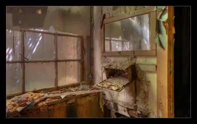
Here's another from the same shoot.

Reflecting:

 
Some really nice examples of what HDR should look like IMHO, not a fan of the overdone stuff. Your shots have inspired me to give HDR a go. If I had to pick a fav it would be no3, would also like to see a darker, moodier version of it but that's just me.
 
Man...there's nothing better than a creepy old hospital morgue! :D
 
I too like #3. To echo what others said these are perfect examples of a good use of HDR.

Good work.
 
I'm glad that I was able to inspire you, Johnny. That means a lot.

I'm very pleased that so many think that I'm doing HDR the 'right' way. I hope you'll all remember that when I get all dogmatic about what I feel HDR should be.

Here's yet another image from the asylum. The red chair from a different angle. This was a shoot where every one of my HDR subjects turned out to be at least pretty good. I usually have a relatively high percentage of wheat to chaff, but seldom 100%. Sometimes, I get lucky.

False Hope:

$Hospital-Doorway-d.jpg
 
I think these capture the feel of what the place was probably like fairly well. Good job!

#4 I really dislike though, due to the unfortunate accident that the paint peeling under the stairs happens to look just like the sort of greenish artifacts you get when you digitally boost something that was way too dark. Kinda conceptually nifty given your description of the photo's backstory, though.
 
Thanks for your honesty, Gavjenks. I understand what you're saying. I almost binned the image several times along the way because of the horrible institutional green color and the rust. But, on the other hand, they were pretty faithful to what was actually there, based on other images, especially the last one I posted. They mimic overdone tone mapping very well, though, and I do admit to turning up the saturation just a bit to add to whatever drama I could create. That was a touchy decision, finding a balance between a bland and overcooked appearance. Fortunately, the gray wall on the left provides something of a reference point.

The image is probably my least favorite of those I shot that day, but I do like what I was able to make of it. Sort of the sow's ear principle, I suppose; although it's no silk purse, for sure. But I've always been a teacher at heart, so I figured that there's something to be learned from this image, which is why I included the backstory. The lesson is, never give up. In the picture's defense, I do sort of like the Escheresque quality of the stairs.
 
Last edited:
I really like hallway and reflecting, thats the sort of clarity I would hope to aim for in my own work.
 

Most reactions

Back
Top