What's new

Four of my best shots today. C&C appreciated!

nmasters

TPF Noob!
Joined
Dec 22, 2011
Messages
209
Reaction score
14
Location
Georgia
Can others edit my Photos
Photos OK to edit
Today I went on a photography adventure. I tried waterfall photography for the second time, and I think I nailed it.
Please share your opinions and feel free to critique!
I really appreciate those who take the time to help beginner photographers.
Thanks!

#1

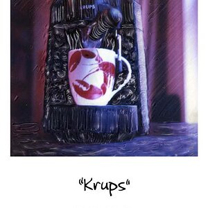
DSC_0118 by nico418, on Flickr

#2
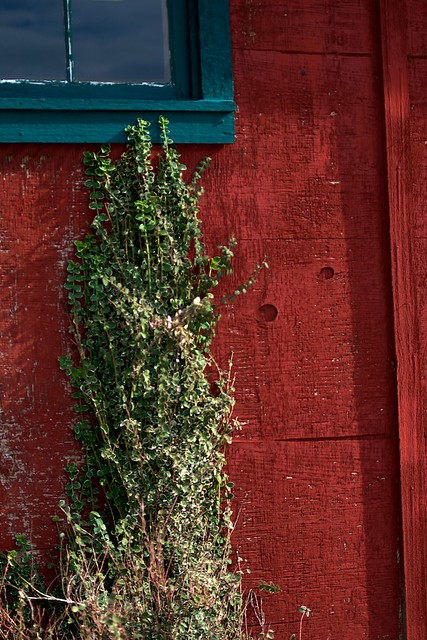
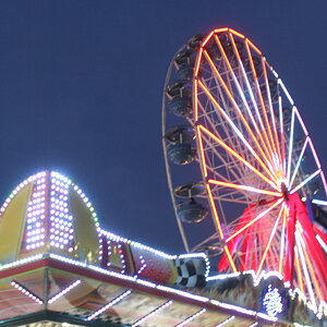
DSC_0218 by nico418, on Flickr
DSC_0118 by nico418, on Flickr

#3

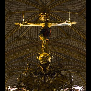
DSC_0050 by nico418, on Flickr

#4

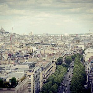
DSC_0024 by nico418, on Flickr
 
I know more than a newbie but am no expert but I think you did a great job on the waterfall. I like the saturation and colors.
 
#1 nice shot... nice treatment of the moving water, and brilliant colors!

#2... I like this.. color wise, it works! I think it would be improved with straightening the shot so that the verticals are aligned with the edges of the photo.. and keep as much of the board on the right that you can.

#3.. meh.. tree is too distracting. Nice geos and shadows though...

#4 nice lines.. I like the composition. The leading lines.. want to lead my eyes left to right which feels backwards for some reason.. creates a nice tension in the shot. Constrast seems good.. but could be a little better... no real whites.. no real blacks...
 
#1, I know water looking like melted plastic is in favour but I much prefer it to look like water. That said, your composition is too centred, the flow is straight on to the camera. If you had moved to the right the water would be seen to be flowing from top right to lower left & I my opinion a better composition.

I will leave the others shots for others to comment on.
 
The first photos could be better, I think you are trying to make the waterfall the main subject - however there is too much going on in the photo. I think you should try to take this photo again, this time try to isolate the subject and maybe use the rule of 3rds.

I also like the 3rd photo. But again, I think it could be better. I think you were going to a more abstract approach with this one. The threes take away from that effect and are distracting. I would try to shoot it from a different angle and move the branches out. Also, this look like it was edited later to give it the black and white effect, if you want it to look like a real black and white, there needs to be more contract. The colors are grayish and kind of blend into each other here.

Hope this helps!
 
I know more than a newbie but am no expert but I think you did a great job on the waterfall. I like the saturation and colors.

Thank you very much!

#1 nice shot... nice treatment of the moving water, and brilliant colors!

#2... I like this.. color wise, it works! I think it would be improved with straightening the shot so that the verticals are aligned with the edges of the photo.. and keep as much of the board on the right that you can.

#3.. meh.. tree is too distracting. Nice geos and shadows though...

#4 nice lines.. I like the composition. The leading lines.. want to lead my eyes left to right which feels backwards for some reason.. creates a nice tension in the shot. Constrast seems good.. but could be a little better... no real whites.. no real blacks...

Thanks for your input. Here is another take on #3, is it better?

DSC_0055 by nico418, on Flickr


#1, I know water looking like melted plastic is in favour but I much prefer it to look like water. That said, your composition is too centred, the flow is straight on to the camera. If you had moved to the right the water would be seen to be flowing from top right to lower left & I my opinion a better composition.

I will leave the others shots for others to comment on.
Thanks for your opinions.
I actually cropped it that way, because I felt like my original composition was too cluttered.
Here is the original:

DSC_0116 by nico418, on Flickr

Do you think the original is better?
 
The first photos could be better, I think you are trying to make the waterfall the main subject - however there is too much going on in the photo. I think you should try to take this photo again, this time try to isolate the subject and maybe use the rule of 3rds.

I also like the 3rd photo. But again, I think it could be better. I think you were going to a more abstract approach with this one. The threes take away from that effect and are distracting. I would try to shoot it from a different angle and move the branches out. Also, this look like it was edited later to give it the black and white effect, if you want it to look like a real black and white, there needs to be more contract. The colors are grayish and kind of blend into each other here.

Hope this helps!

Thanks for that tip on B&W! I will do that next time.
I was kinda going for an abstract approach, because while I was there I had taken so many photos of just the buildings.
The problem with my composition on #1 is that I didn't have as much freedom to choose a good vantage point with my cumbersome tripod. I didn't want to put it in the water. However, I do think I could have done better with my composition.
Thanks for your advice!
 
The first photos could be better, I think you are trying to make the waterfall the main subject - however there is too much going on in the photo. I think you should try to take this photo again, this time try to isolate the subject and maybe use the rule of 3rds.

I also like the 3rd photo. But again, I think it could be better. I think you were going to a more abstract approach with this one. The threes take away from that effect and are distracting. I would try to shoot it from a different angle and move the branches out. Also, this look like it was edited later to give it the black and white effect, if you want it to look like a real black and white, there needs to be more contract. The colors are grayish and kind of blend into each other here.

Hope this helps!

Thanks for that tip on B&W! I will do that next time.
I was kinda going for an abstract approach, because while I was there I had taken so many photos of just the buildings.
The problem with my composition on #1 is that I didn't have as much freedom to choose a good vantage point with my cumbersome tripod. I didn't want to put it in the water. However, I do think I could have done better with my composition.
Thanks for your advice!

Sounds good. You might want to buy a gorillapod that way you can attack it to trees and other objects in the "wilderness."
 
On the waterfall, the main subject is the waterfall itself. That said, the exposure on it needs to be nailed down above any other considerations for the shot. As is, it's overexposed, blowing out way too much of it. Not crazy about the blue cast of it either.

Now then, if you bring the exposure down, you're going to lose even more detail in the darker areas of the photo, which there are a lot of already. I'm thinking a reflector, even a cheap white foam board or posterboard, would help get some more light up into the shadow areas and would help a lot. They don't need to be lit like daylight, just enough to give us a little bit of detail so that we can get a sense of depth in there. You could also do it in multiple exposures and use masking techniques or HDR in post.

BTW, I've had my tripod in the water plenty of times over the years with no ill effects. You could always use garbage bags and rubber bands to keep the legs dry. I keep stuff like that in my bag at all times. It doesn't take up much room nor add any real weight, and it comes in handy in oddball situations.
 
I see what you mean with the shadows. I think I will go back and try doing an HDR shot. This time I'll bring some boots and bring my tripod in the water for that perfect shot! Thanks for your advice.
 
I like #3 the way it is.. I like b&W pictures. I would clone out the satellite dish at the top..Don't ask me how I noticed it, but I find it distracting..LOL!! I also like #4. I like the reflection of the clouds in the window.

disclaimer: I am new at all this, so I'm a little hesitant to give C&C since I don't feel qualified. All pictures look great in my untrained eyes. :lol:
 
TamiAz said:
I like #3 the way it is.. I like b&W pictures. I would clone out the satellite dish at the top..Don't ask me how I noticed it, but I find it distracting..LOL!! I also like #4. I like the reflection of the clouds in the window.

disclaimer: I am new at all this, so I'm a little hesitant to give C&C since I don't feel qualified. All pictures look great in my untrained eyes. :lol:

Thanks for your input! No need to be hesitant, any kind of C&C is welcome ;)
 
The waterfall! Vertical framing..........I agree the water is excessively blurred and over exposed.

No one can show you other possibilites, because for whatever reason you don't allow editing of your photos.

How are you doing the B&W conversion?
 
Hi, obviously I'm new so take what I say with a pinch of salt, but for #2 I think it would be a little better if the frame of the shot lined up with the red vertical plank, as it is the picture looks a little lopsided. I love your waterfall, although as someone else said it might have been cool to put it slightly off-centre. Still, good job (I think!)
 
#1 Like many have said, the water is overexposed, the contrast is high and theres a slight blue cast. I don't mind the cast that much. Cropping it the way you did was definitely the right thing to do

#2 Sorry, this is a "nothing" photo for me - it just doesn't do anything for interest. I feel the window frame is a big distraction. Perhaps getting in closer to get more deal of the leaf may have worked?

#3 Really like this one. The high contrast B&W makes this pop for me, with the trees giving a feel that nature is taking back over.

#4 I am a bit torn with. I have the feeling theres the making of a good photo here - the exposure and contrast are good, but theres something that I can't quite put my finger on that irks me about the composition. Maybe it's the angle. I don't know :)

Hope this is useful :)
 

Create an account or login to comment

You must be a member in order to leave a comment

Create account

Create an account on our community. It's easy!

Log in

Already have an account? Log in here.

New Topics

Back
Top Bottom