OP
OP
nmasters
TPF Noob!
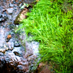
The waterfall! Vertical framing..........I agree the water is excessively blurred and over exposed.
No one can show you other possibilites, because for whatever reason you don't allow editing of your photos.
How are you doing the B&W conversion?
I use the in camera monochrome setting. What do you recommend for B&W conversion?
I have changed the option to edit my photos; please feel free to show me other possibilities!
Greatly appreciated.
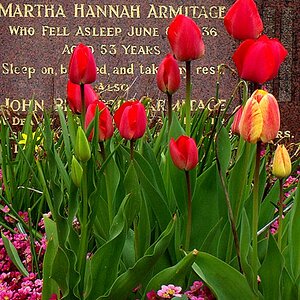
Hi, obviously I'm new so take what I say with a pinch of salt, but for #2 I think it would be a little better if the frame of the shot lined up with the red vertical plank, as it is the picture looks a little lopsided. I love your waterfall, although as someone else said it might have been cool to put it slightly off-centre. Still, good job (I think!)
I see what you mean with #2. Thanks for pointing that out!
#1 Like many have said, the water is overexposed, the contrast is high and theres a slight blue cast. I don't mind the cast that much. Cropping it the way you did was definitely the right thing to do
#2 Sorry, this is a "nothing" photo for me - it just doesn't do anything for interest. I feel the window frame is a big distraction. Perhaps getting in closer to get more deal of the leaf may have worked?
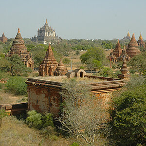
#3 Really like this one. The high contrast B&W makes this pop for me, with the trees giving a feel that nature is taking back over.
#4 I am a bit torn with. I have the feeling theres the making of a good photo here - the exposure and contrast are good, but theres something that I can't quite put my finger on that irks me about the composition. Maybe it's the angle. I don't know")
Hope this is useful
Thank you for your critique. Very helpful!