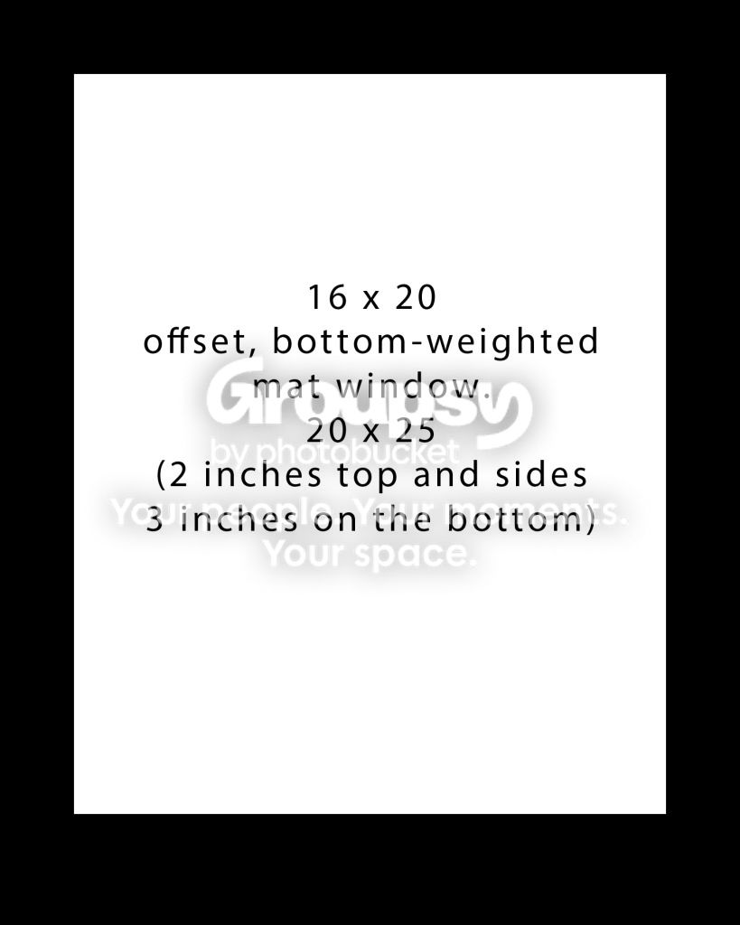
I agree with the bottom-weighting of mats...it looks MUCH better to have more mat space at the bottom of a print. I like a 1:1:1: to 1.5 ratio...which is exactly what KmH's illustration shows If there is not extra space at the bottom, the image often looks as if it has no "base". It's kind of hard to describe, but a perfectly-centered image in a mat and frame does not look quite right.





![[No title]](/data/xfmg/thumbnail/36/36099-feb952513e45dbf9f061ab28c1dc1121.jpg?1734168043)


![[No title]](/data/xfmg/thumbnail/36/36100-56ca0f8143ffca369fbf5f3dfe9cabd4.jpg?1734168051)