One the first one try layering it and doing a gausian blur on background photo, change layer to soft light and adjust opacity... you might find it helps the photo a lot.
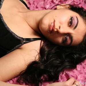
As they currently stand the colour wins over the black and white considerably, as said above the black and white appears to be very washed out - there is just no depth to it; whilst the colour not only has some very rich and vibrant colours, but also a general depth and contrast to the scene.
Reworking the black and white is an option, though I'd say the colour is strong enough to stand on its own.
However the bigger problem that I see is that the photo feels disjointed. We've essentially got 3 parts to it that don't relate well to each other; the Portrait of the woman with the eyes looking at the viewer/off to the left side of the photo; the body and shoulder of something (if you didn't say horse in the title it could easily be - well anything big and in the black and white the loss of texture it could easily be a rock); and finally we have a blurry hand creeping up the body on the right side.
The different element don't mix well, the portrait (where we first look) is sending our look off to the left and away from the rest of the photo; the horse body is lacking any point of interest or focus, its just a black lump with part of a shoulder; whilst the hand has been rendered so far out of focus which, combined with its angle, makes it look like its not her hand but someone else's crawling up the horses body.
Personally I would say crop the shot so that we just have a portrait aspect shot of the women; I can see where you were going with the rest of the shot but there is just no clear association between the different elements to really make it work (at least in my view). A bit more depth of field; maybe her hand moved a bit further forward; a slightly different angle to show a tiny bit more of her arm and something a bit more of the horse and I think it would work. If you wanted to keep the horse away from being a major focus then her angle and eye direction would want to change to be more direct toward the viewer to engage directly (at present there is this distinct left side looking feel). That at least focuses us on the rider, lets the horse be mute in the background and doesn't unbalance the photo.
Also note there is every chance that the person in the photos (assumed the horse's owner/rider) likes the photo becauase she is already connected to the various elements because she took part (she knows its her hand without question) and because its her and her horse in the shot; that shouldn't however distract a photographer from the more clinical assessment of a photo.
Part and parcel of working with animals is - well - working with them. I think you needed to step back a fair bit and let the horse itself become part of the photo or otherwise simply count it out and focus on the model herself (which appears to be the area you've far more experience with).
Sadly again in the second shot we've got a good post and finish over the model, but the horses are just rendered as monocoloured lumps now.
Personally I'd say if you want to take this further what you need to do is step back and learn some horse portrait and general photography methods first - make the horse your subject and learn to frame and work with them - then you can bring model and horse together and merge the two.
Color is far better than the mono conversion. I'd like to see a similar shot with the horse's face visible. Perhaps cheek to cheek with the horse.


 [/U
[/U
") It's quite hard to make horse posing.
It's quite hard to make horse posing. 

![[No title]](/data/xfmg/thumbnail/41/41781-7dcfd2ee71d4a453b4ad9fb5c7e723f1.jpg?1619739890)
![[No title]](/data/xfmg/thumbnail/41/41778-1940e957c27e1919c300dfedbc32d1c3.jpg?1619739889)
![[No title]](/data/xfmg/thumbnail/32/32003-70dfe149c27224e28ba98e975984e01e.jpg?1619735147)